Logo concept for MoneroDice
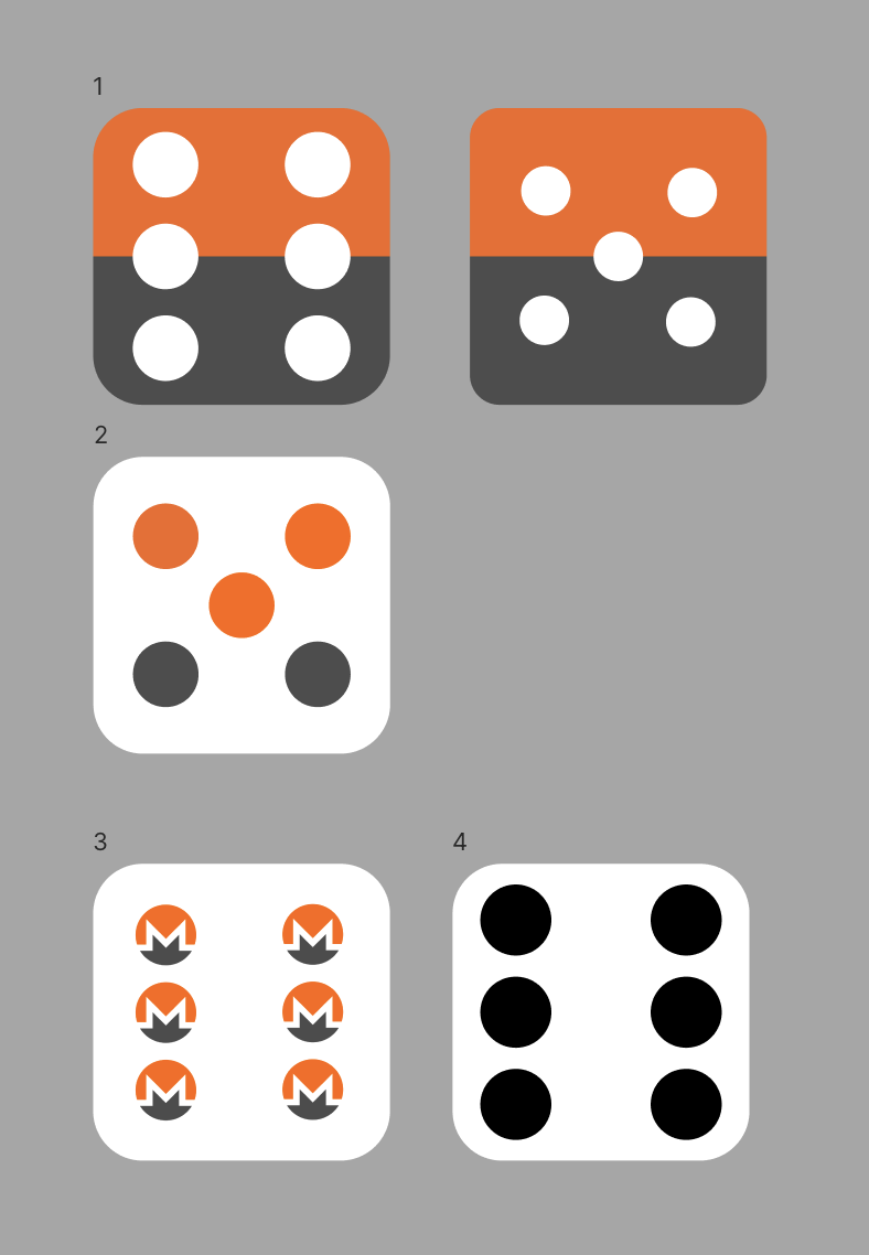
As part of my work for MoneroDice, I was asked to make a logo for the site: “something very simple, based on the Monero logo”.
I started coming up with ideas:

And then designed this prototype:

It even has a little Easter egg: the Monero logo is put in place of the number 3. Three sounding just like free, which Monero helps us become.
But it did not scale down well as a favicon. So I simplified it:

But this version was kind of boring. It needed a special something.
So I turned it by 6 degrees, making the die land in a much more natural position:

This one worked great as a favicon:
However, the client felt that this logo did not have enough in common with the Monero logo, orange beïng their only shared trait.
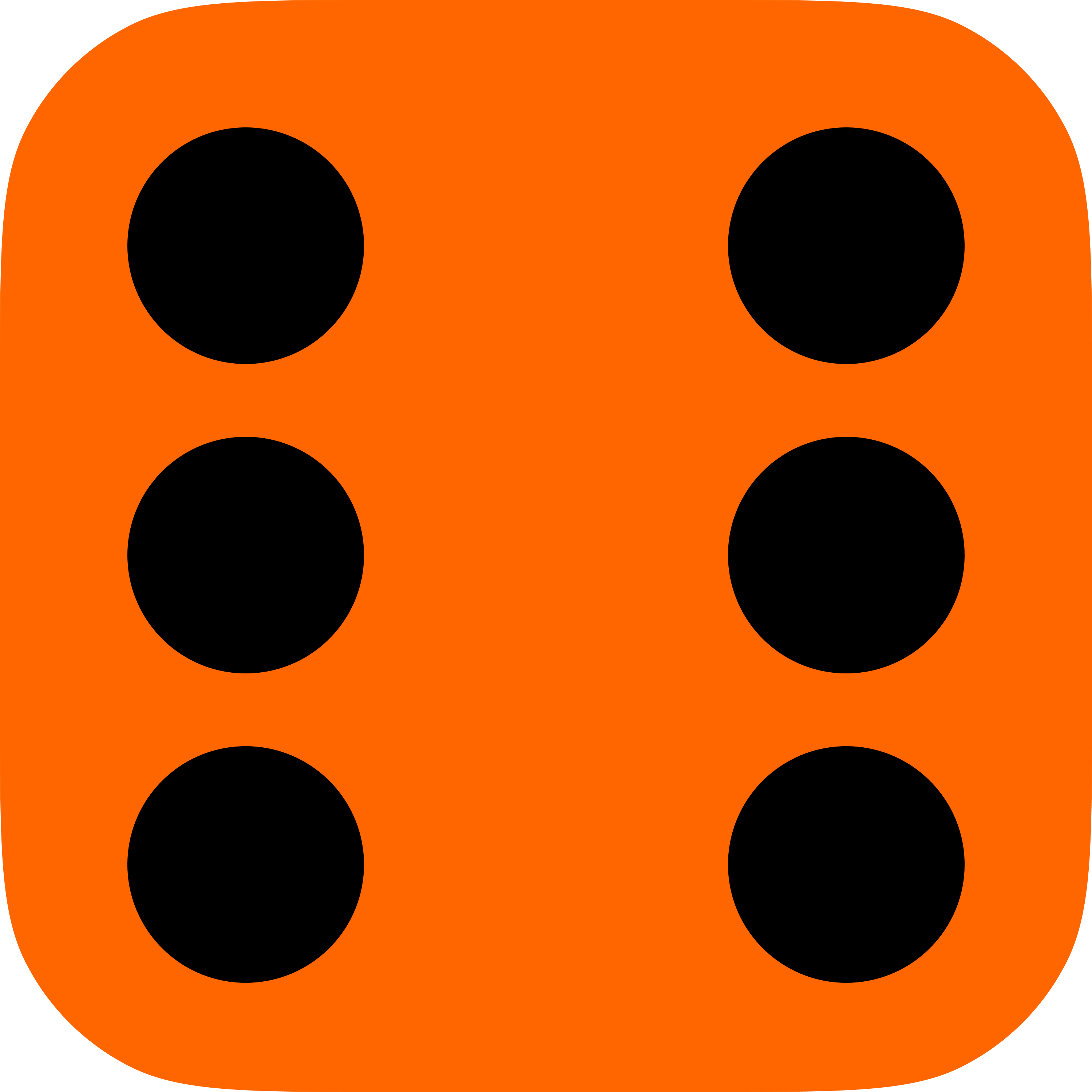
The client then made their own, building upon the 6° angle and rounded corners from mine:

