
Pareidolia is the tendency to see faces (and meaning overall) where there’s none.
A surprised Minion:
Michael Jackson:
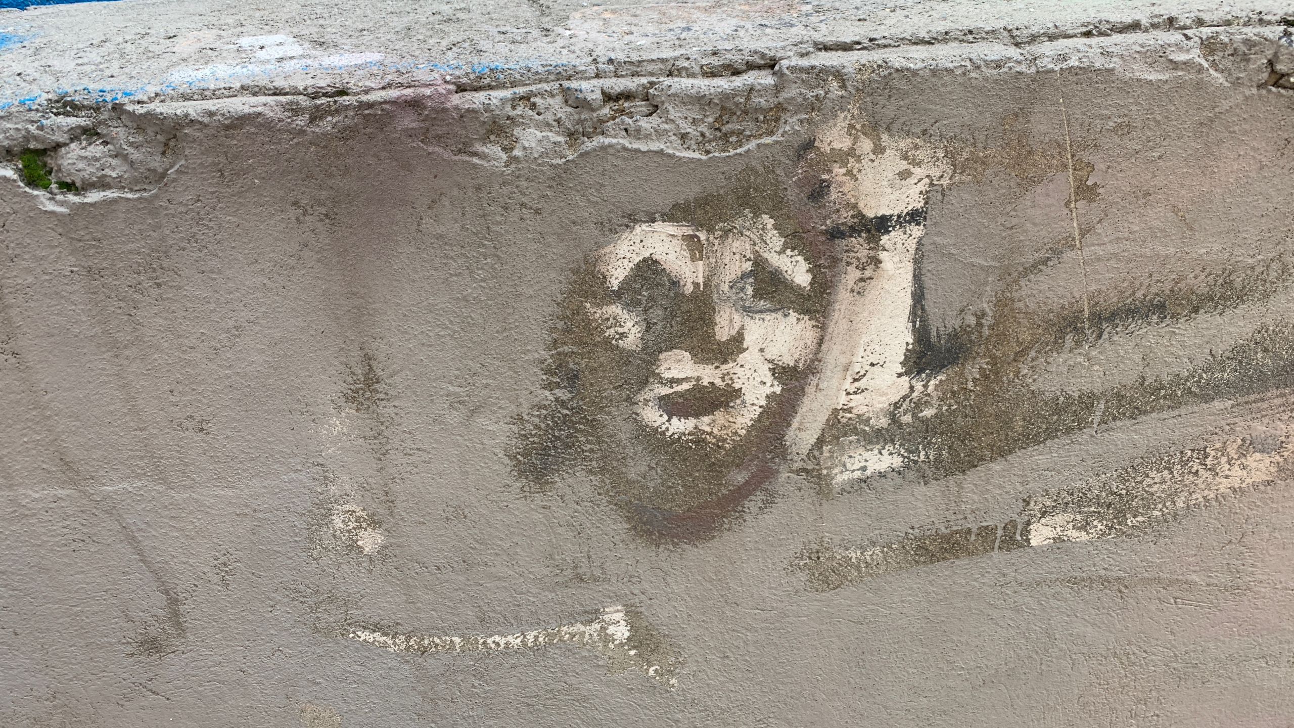
A Roman slave:
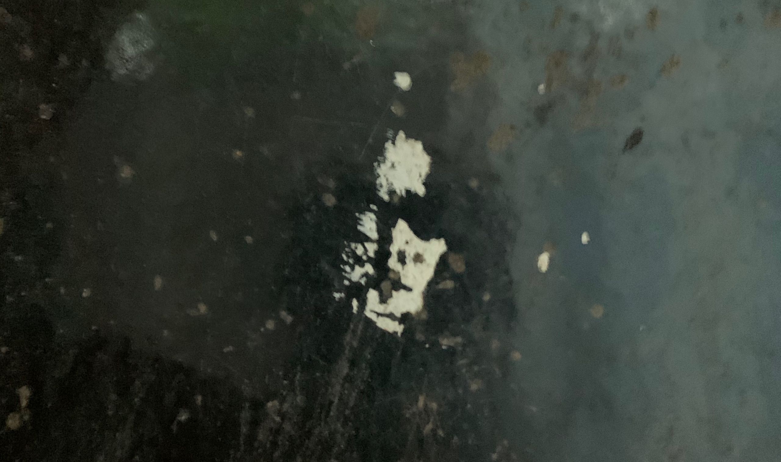
A frog:
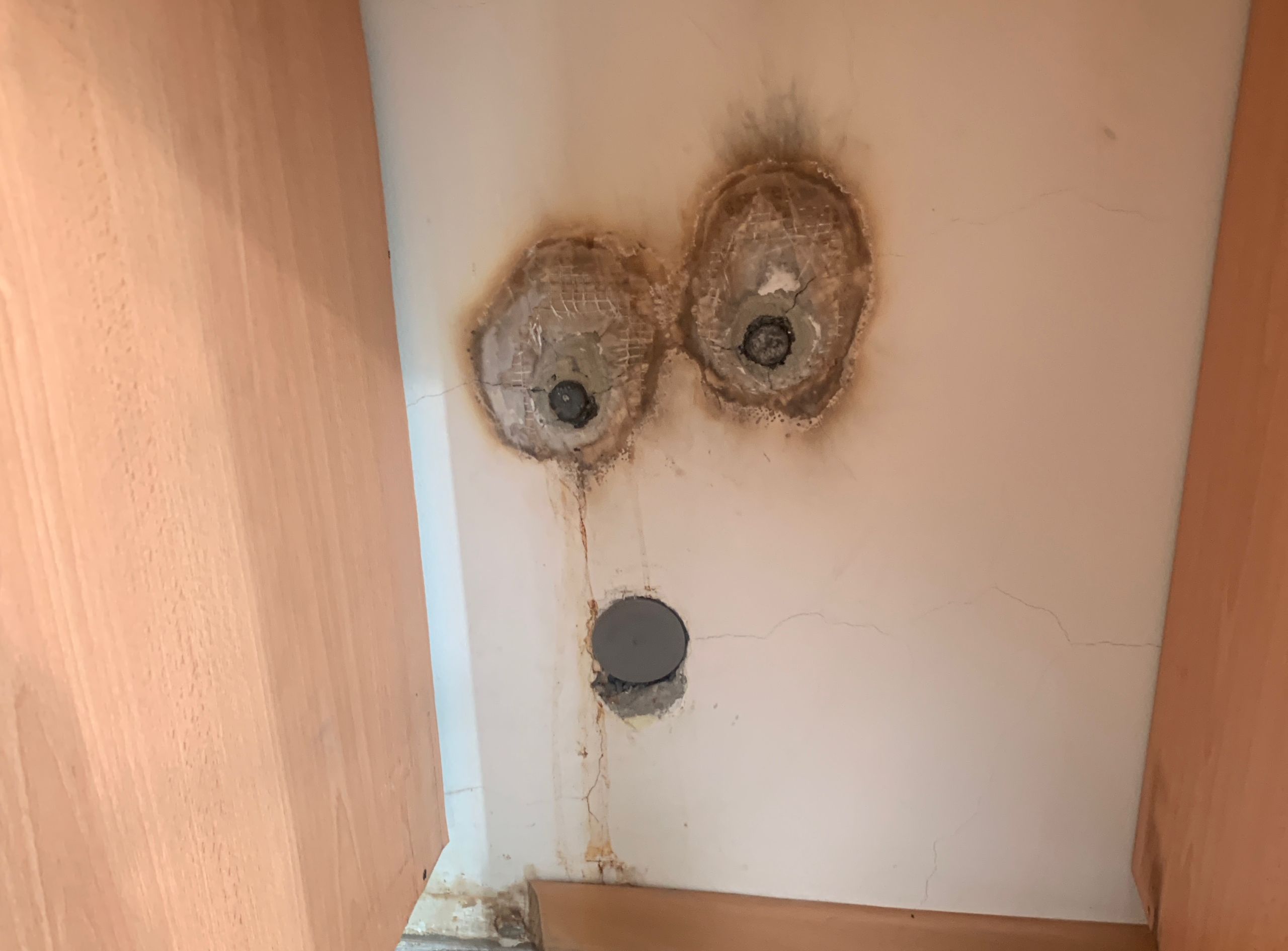
A monster:
Pareidolia is the tendency to see faces (and meaning overall) where there’s none.
A surprised Minion:
Michael Jackson:
A Roman slave:
A frog:
A monster:
K: Hello! I am Kamala Harris, my pronouns are she and her, and I am a woman sitting at the table wearing a blue suit.
Me: Hi Kamala! Will you bring peace to the world?
K: Oh, you know, when we talk about peace in the world, we have to understand that peace is important for the world, and when we have peace, the world can be peaceful. Peace is like a big puzzle, you know, and we have to put all the pieces together to make the puzzle complete, and when the puzzle is complete, then we will have peace in the world, and that’s important. Peace, you know, it’s like, when you have peace, everything is peaceful, and that’s what we want for the world, for it to be peaceful. So, yes, peace is important, and we have to work together to achieve peace in the world.
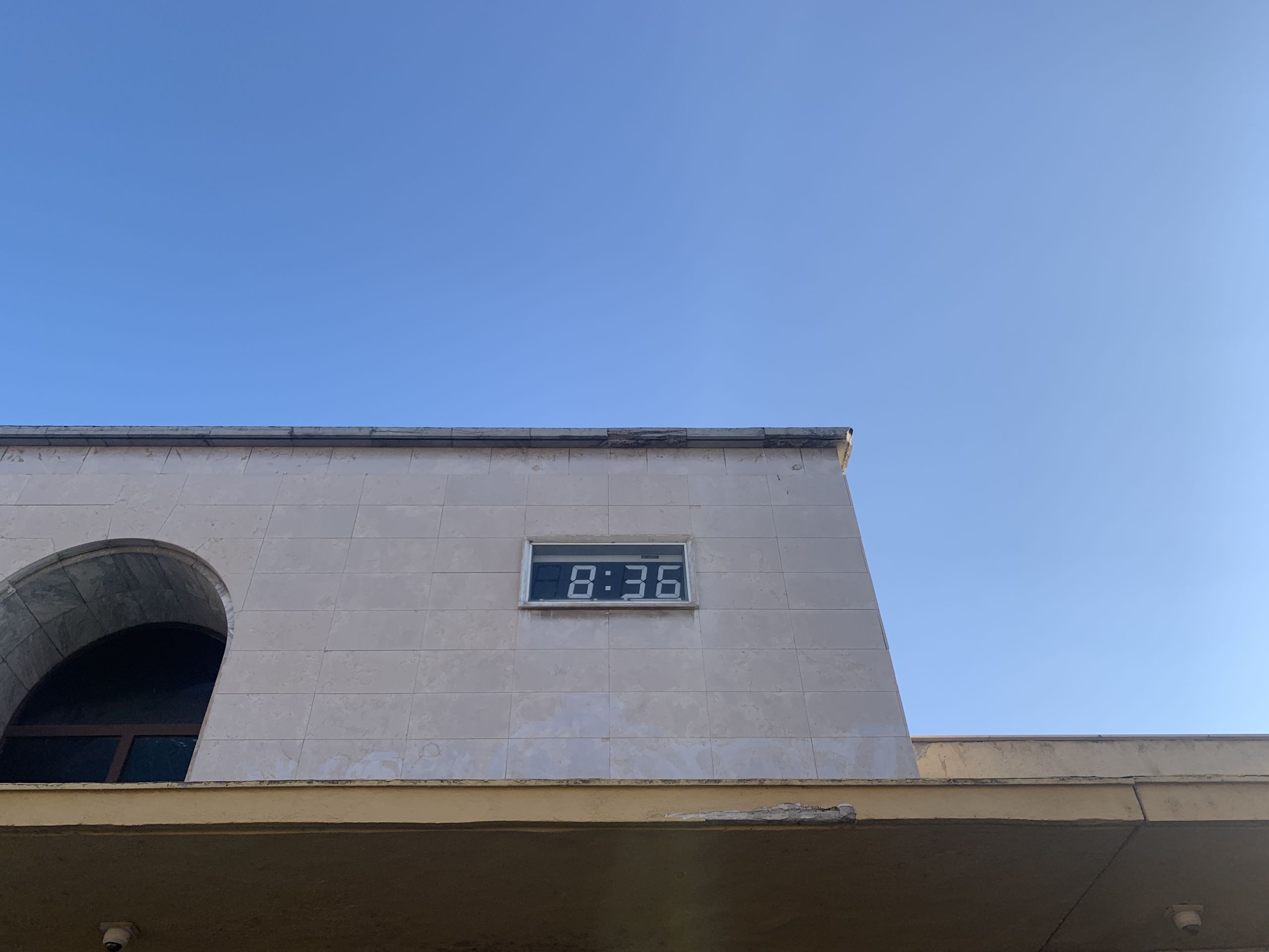
The railway station’s clock:
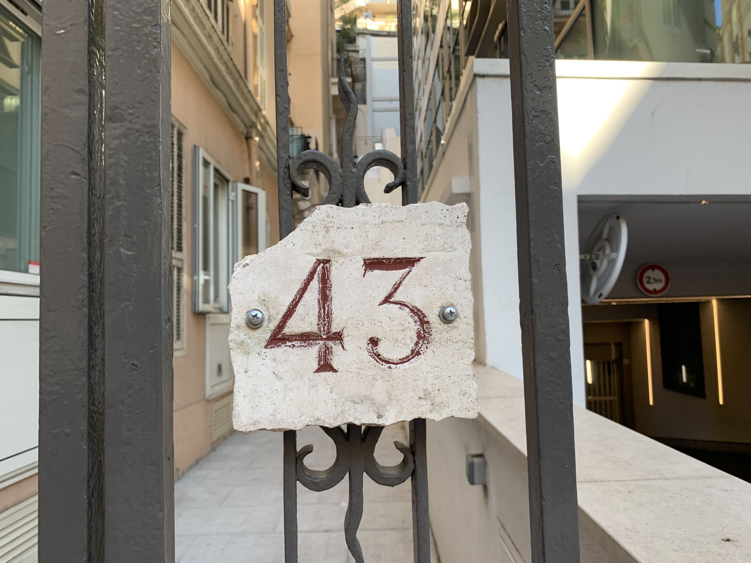
A number plaque:
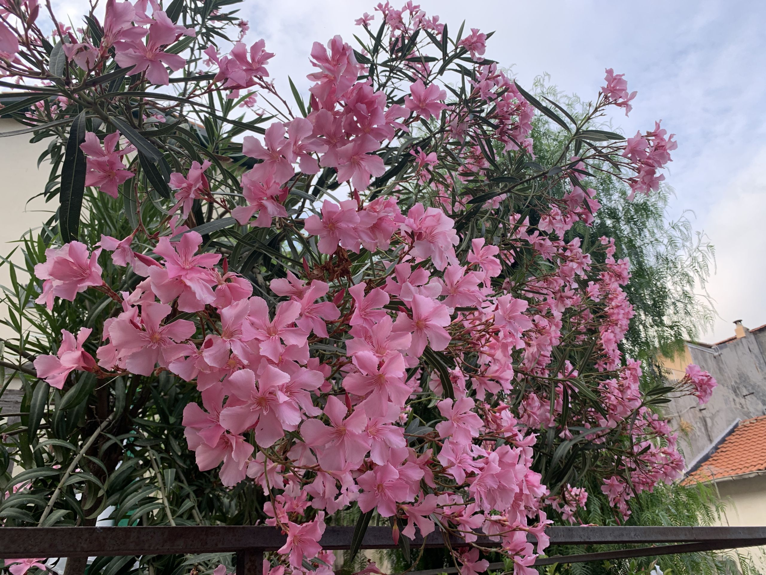
Blossoms:
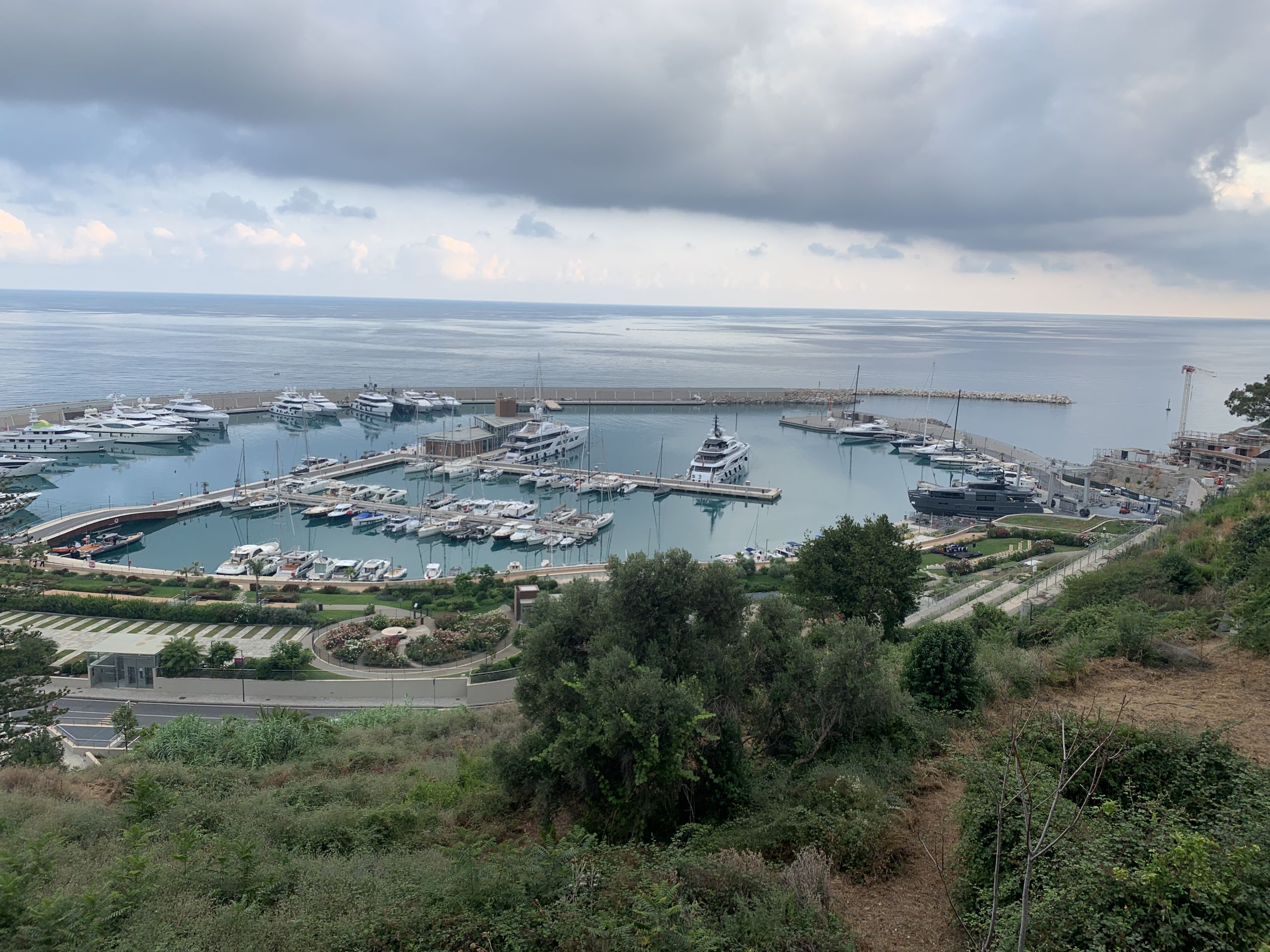
The port:
In Monaco, everything smells amazing: the trees outdoors and perfumes indoors.
Also, strangers greet each other when entering and exiting the elevator. Everyone has true respect for one another.
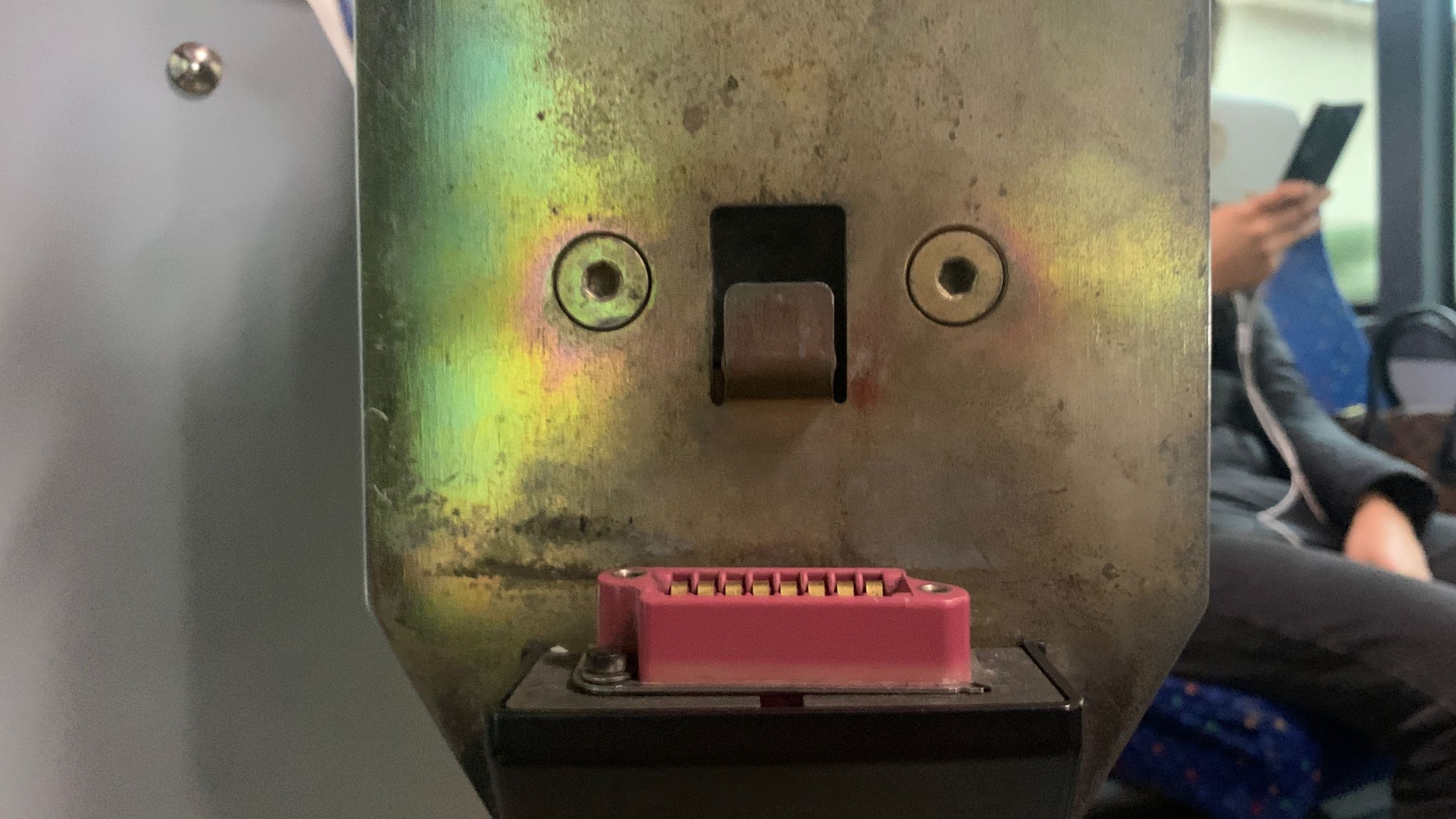
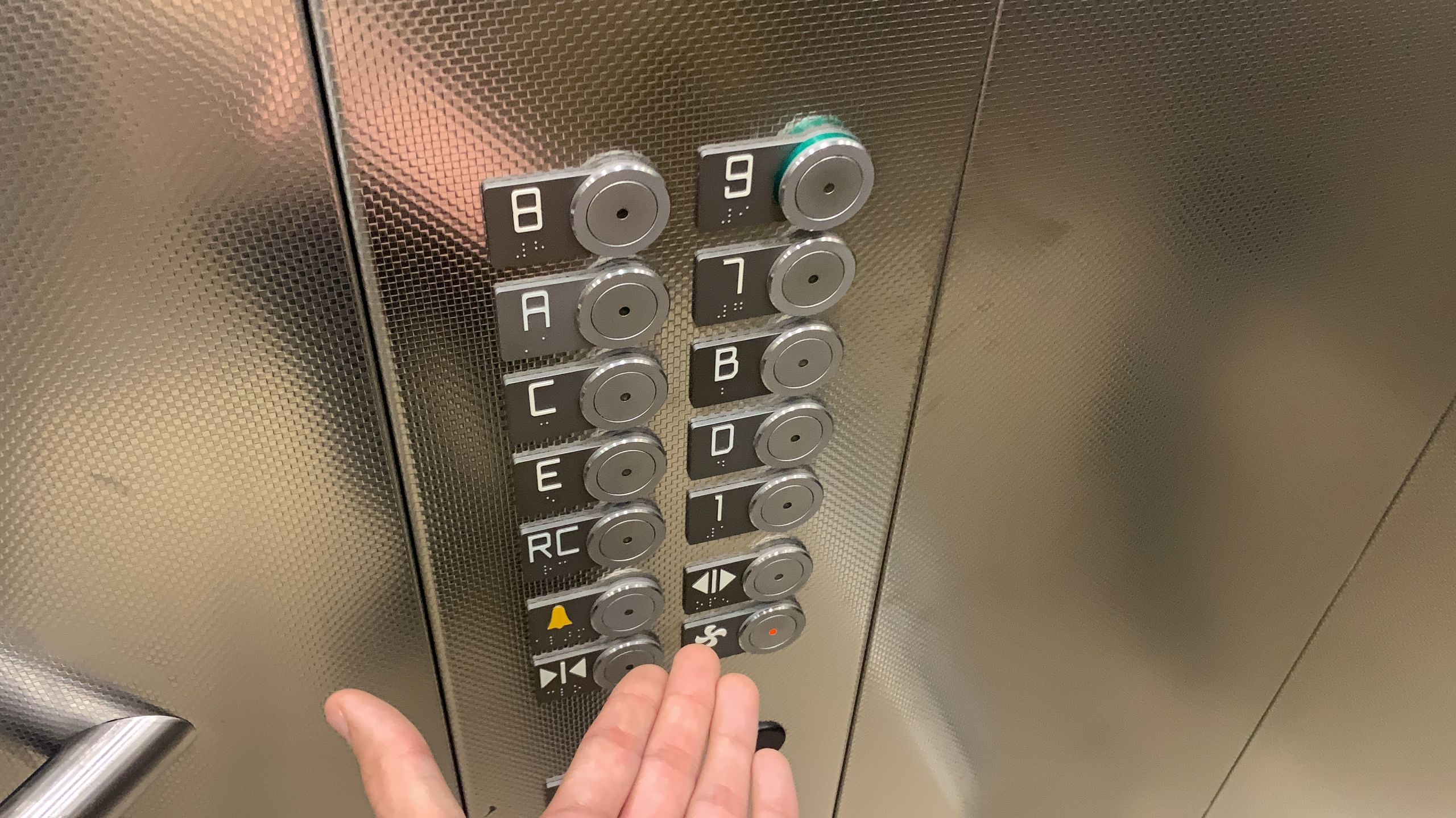
But sadly not all elevators have good typography. The 8 looks too much like a B, and the D looks too much like a zero:
A bit of nature:
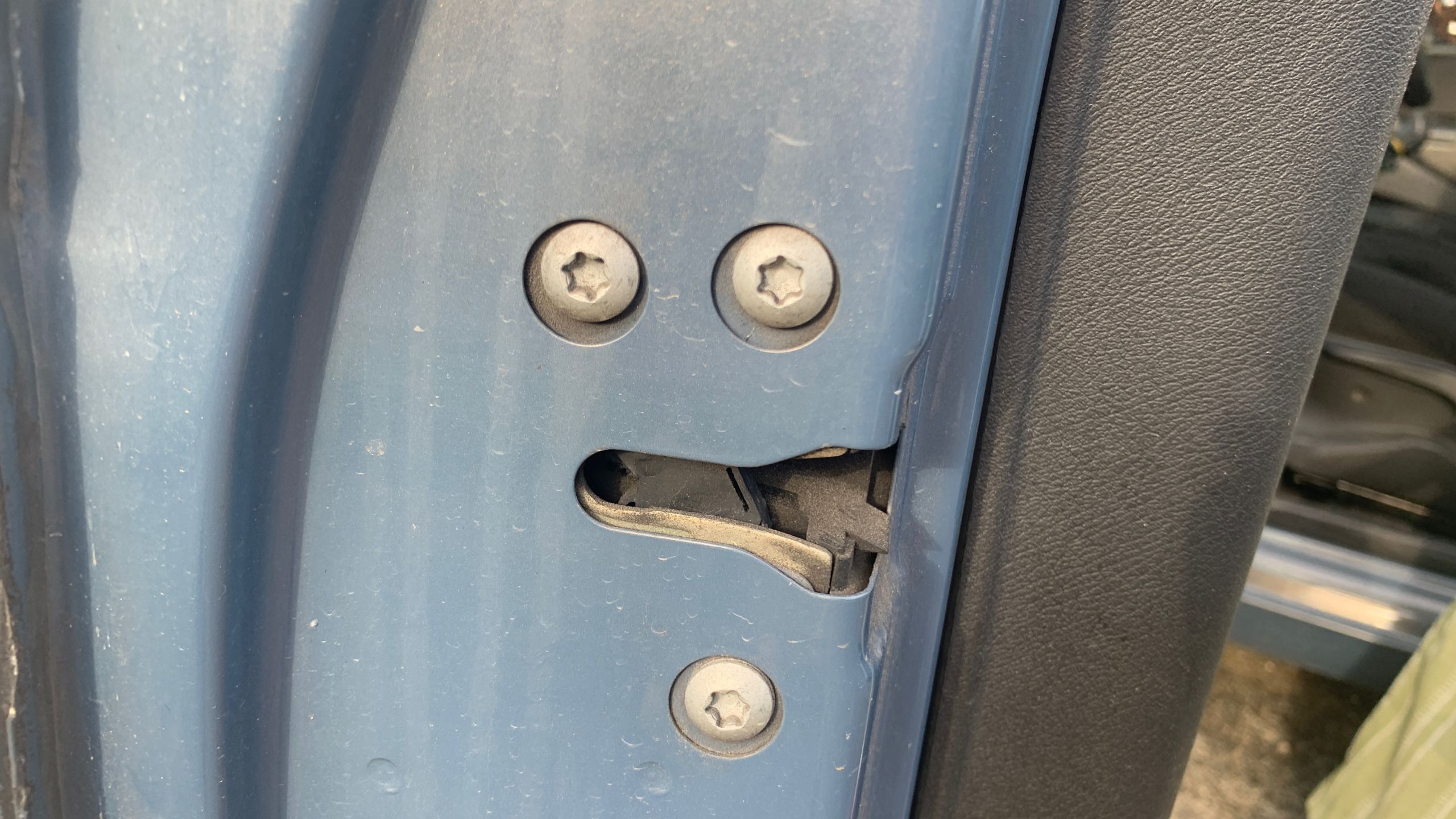
A confident-looking man:
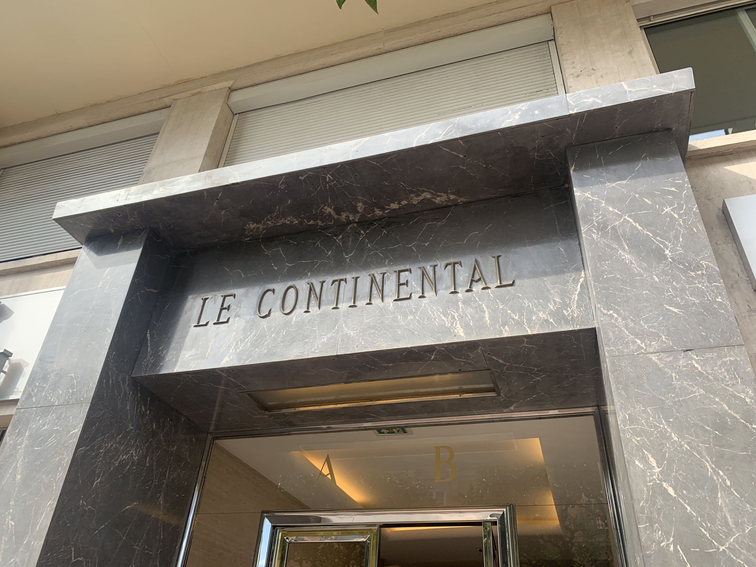
The Continental:
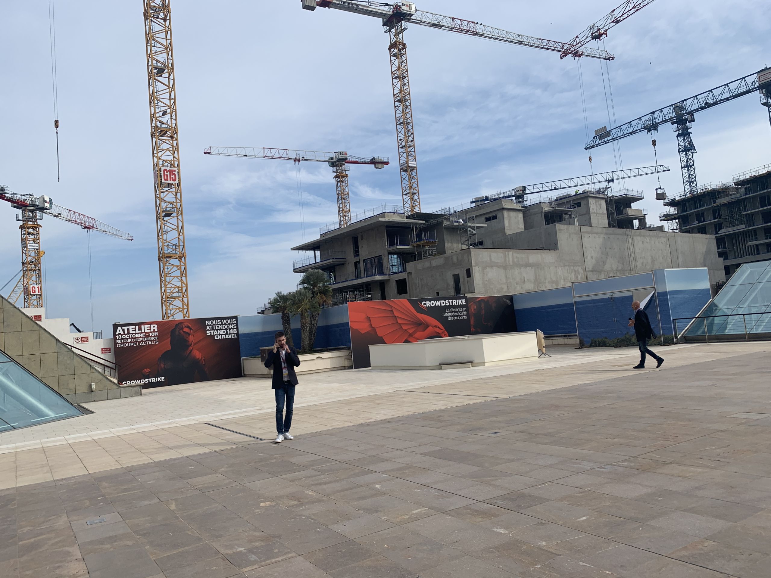
Crowdstrike before it was famous:
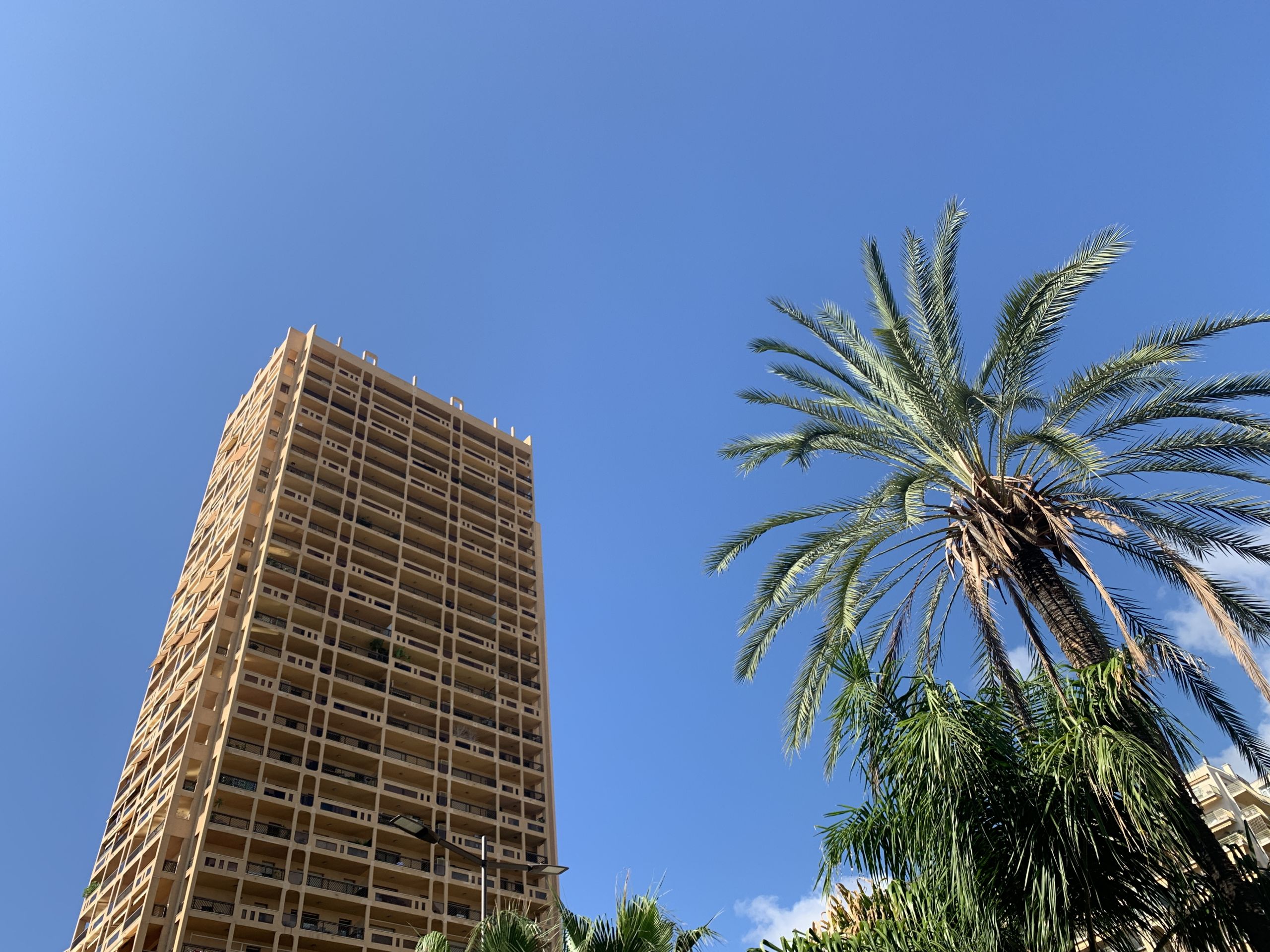
A tall building:
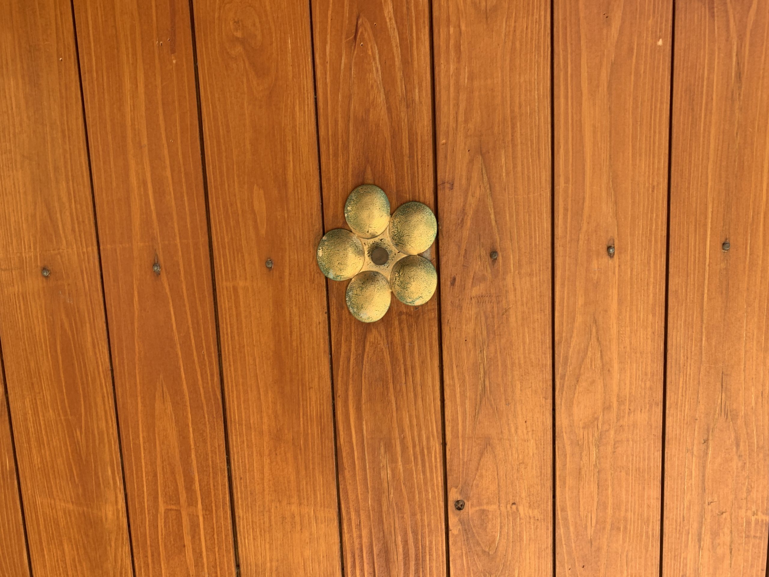
Textures:
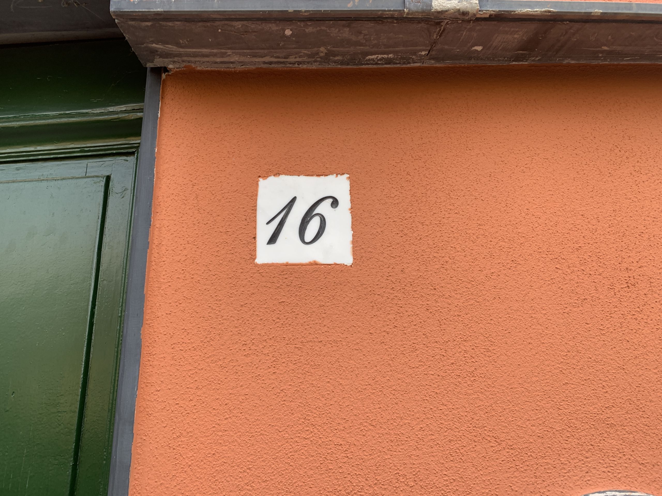
A number plaque:
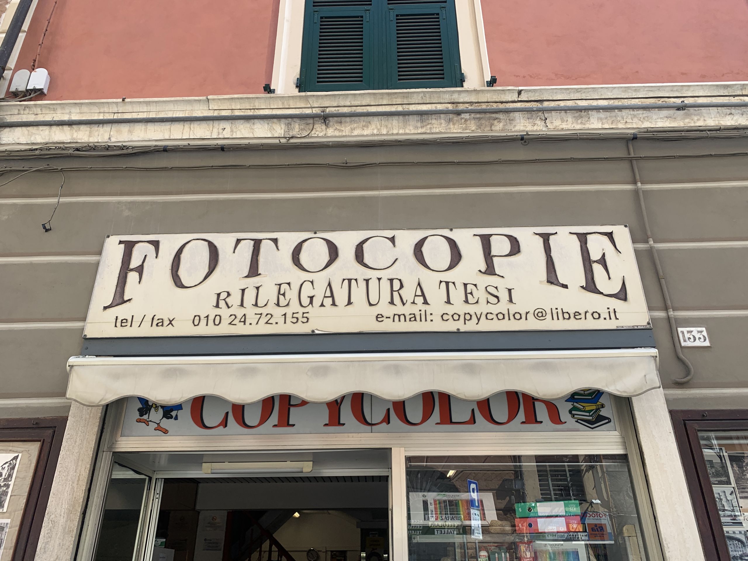
Spooky typography:
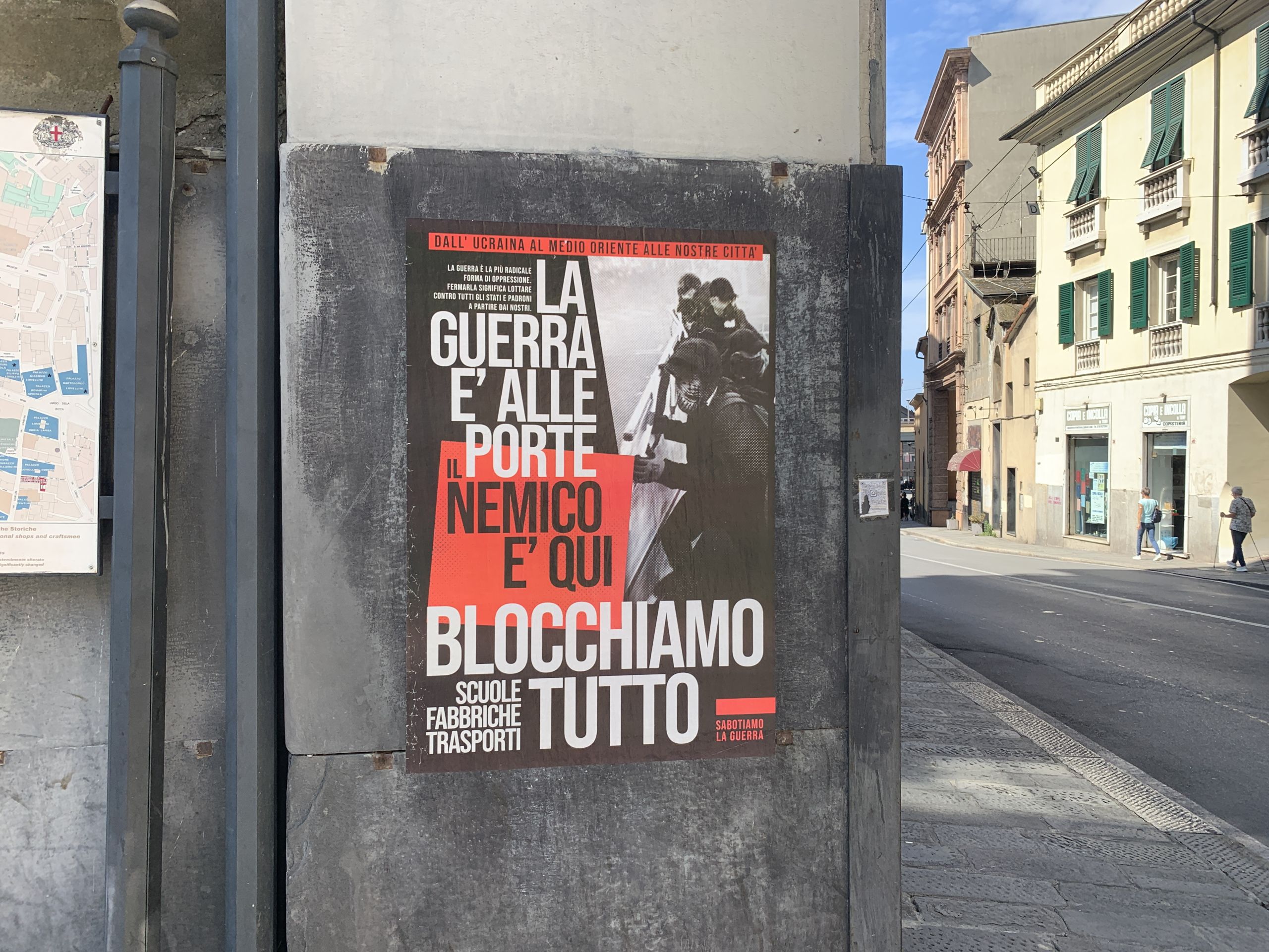
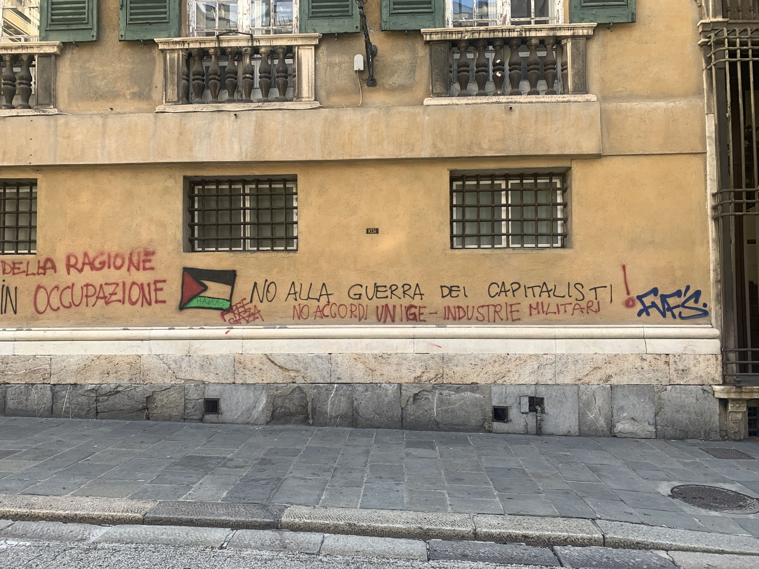
Poster against war:
Vandals against war:
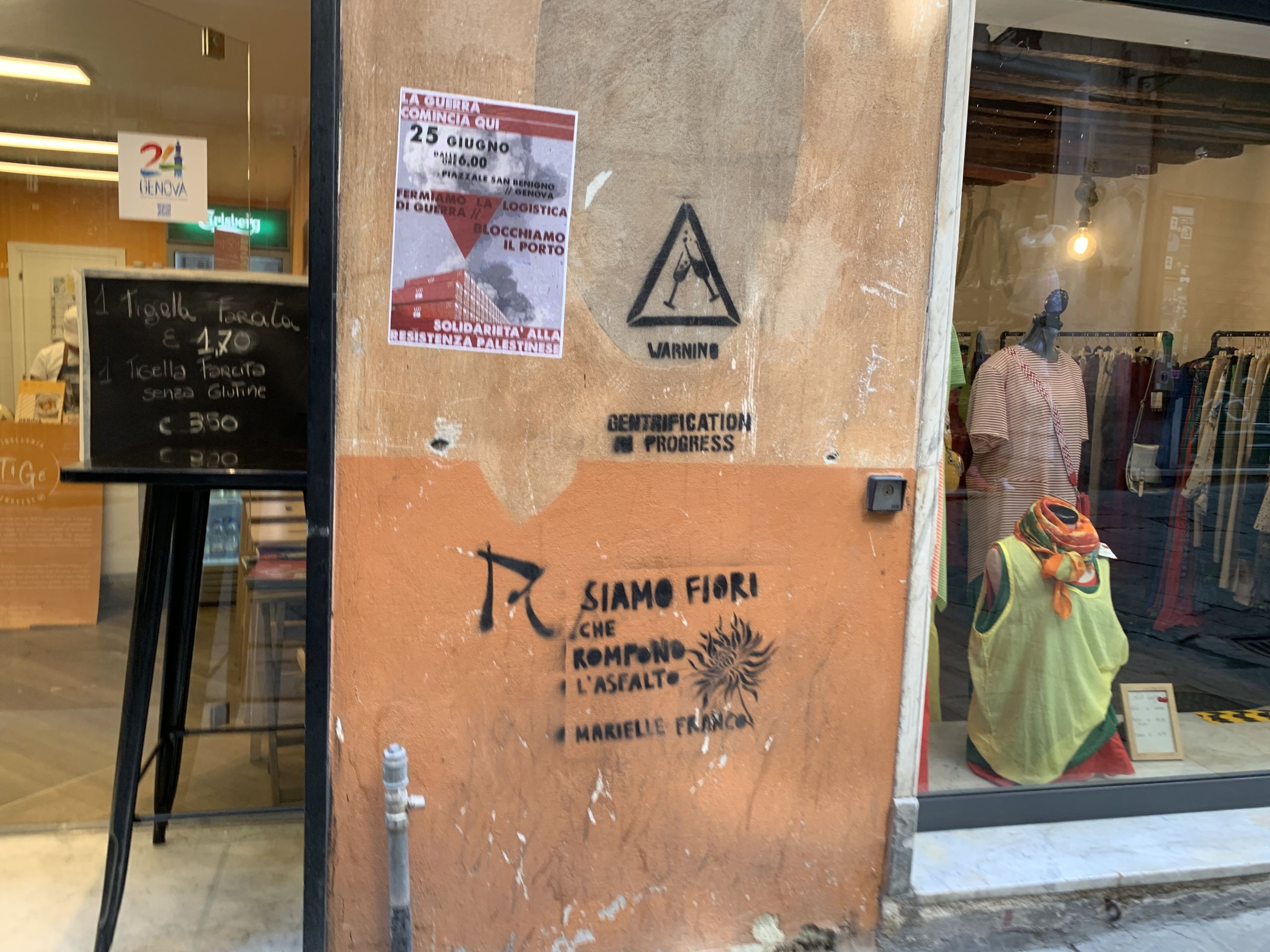
“Warning — gentrification in progress”:
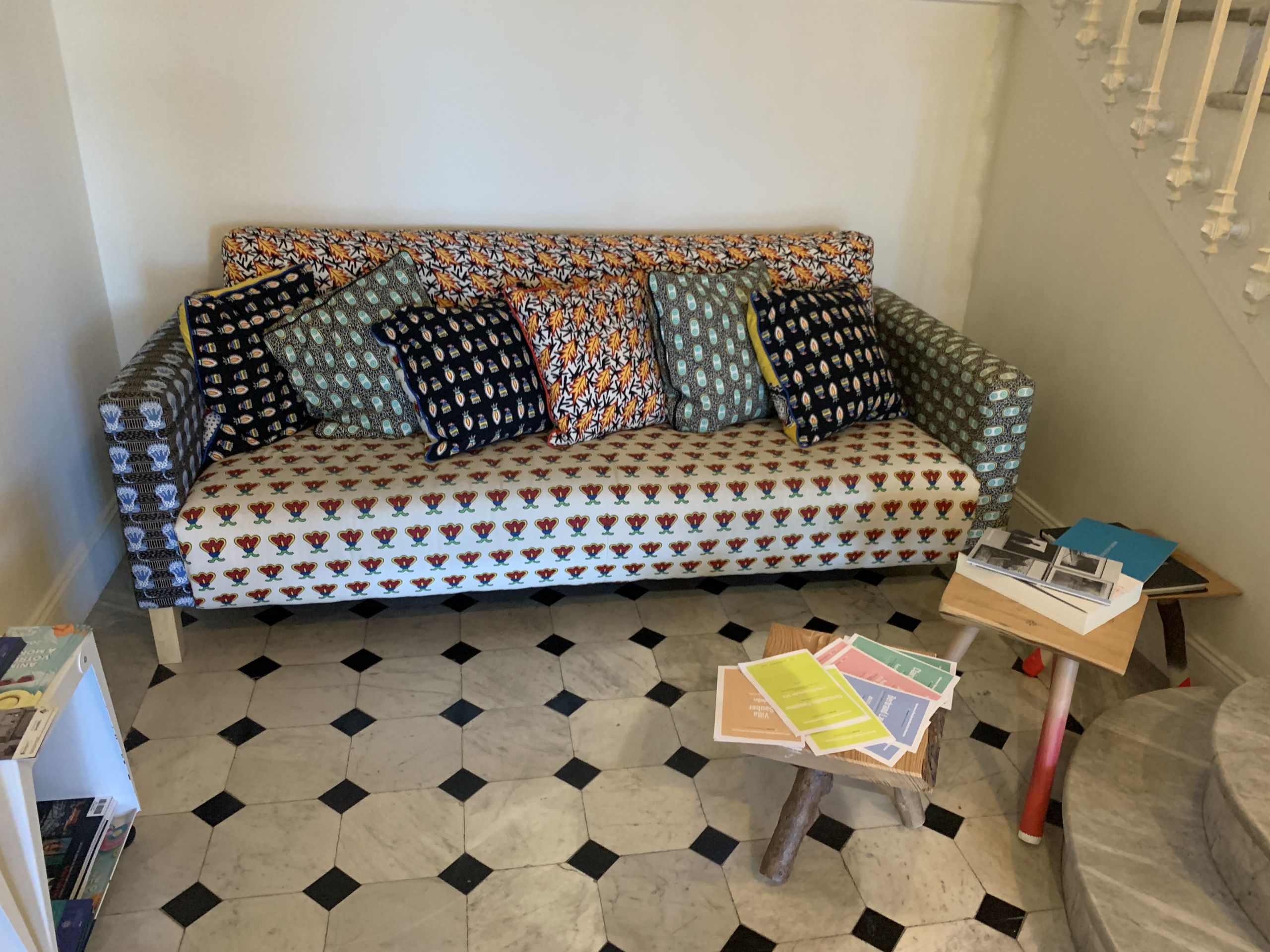
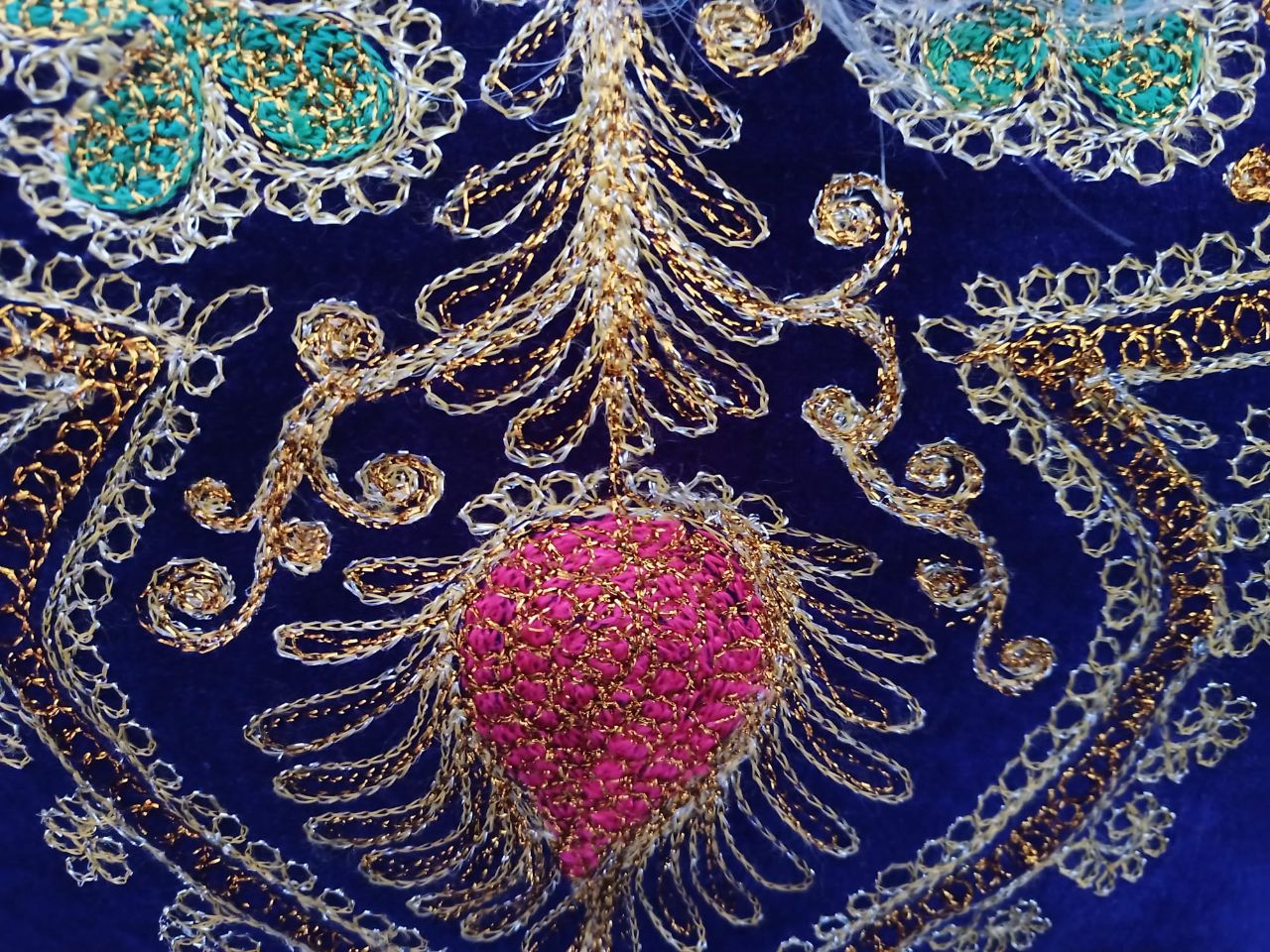
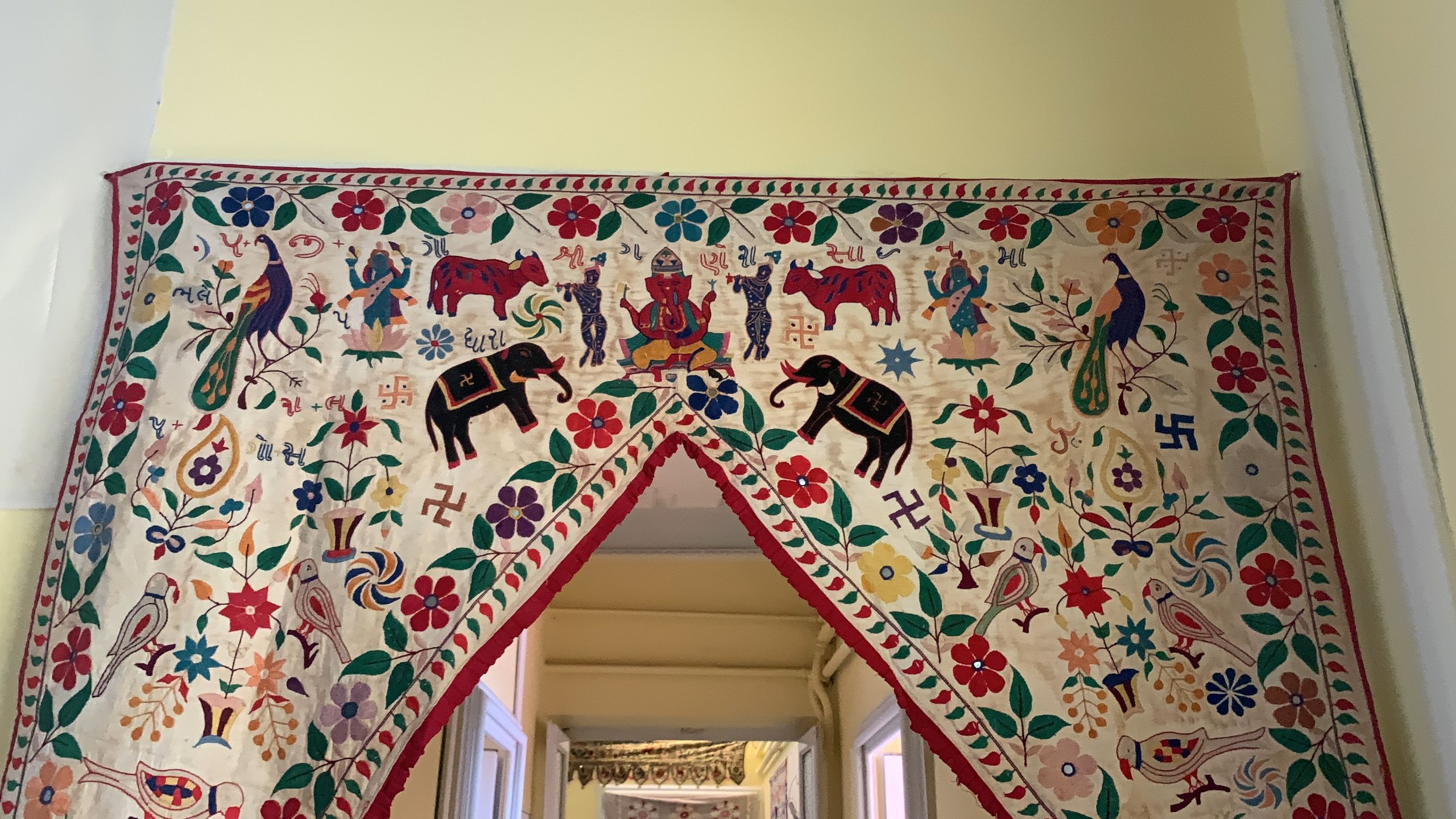
Textiles from Central Asia:
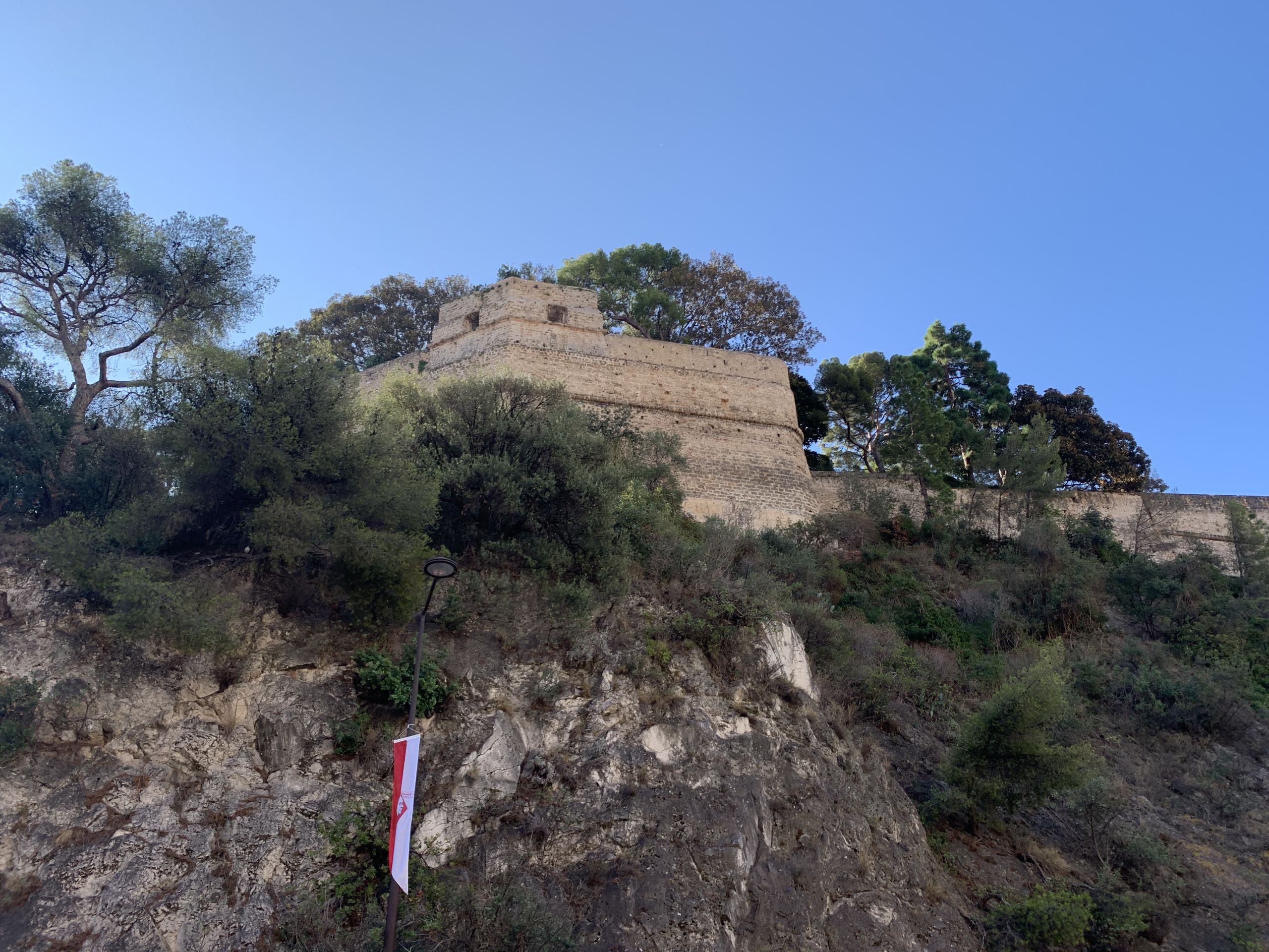
A little tower:

Blossoms:

A passage to the sea:

A homemade plaque:

As part of my work for MoneroDice, I was asked to make a logo for the site: “something very simple, based on the Monero logo”.
I started coming up with ideas:
And then designed this prototype:
![]()
It even has a little Easter egg: the Monero logo is put in place of the number 3. Three sounding just like free, which Monero helps us become.
But it did not scale down well as a favicon. So I simplified it:
![]()
But this version was kind of boring. It needed a special something.
So I turned it by 6 degrees, making the die land in a much more natural position:
![]()
This one worked great as a favicon:
However, the client felt that this logo did not have enough in common with the Monero logo, orange beïng their only shared trait.
The client then made their own, building upon the 6° angle and rounded corners from mine:
![]()
GOD: Grand Old Designer.
This thought somehow came to me while I was asleep.
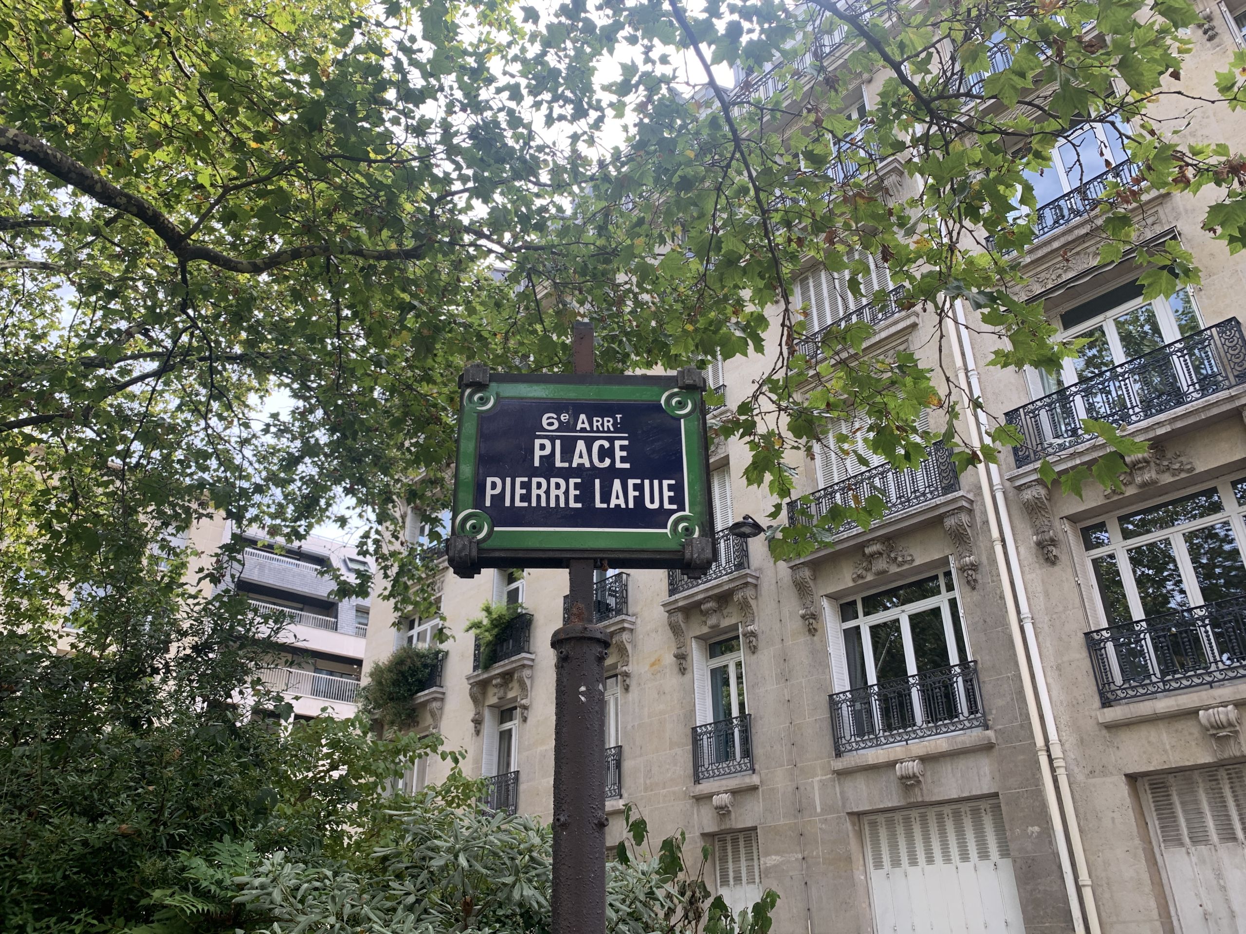
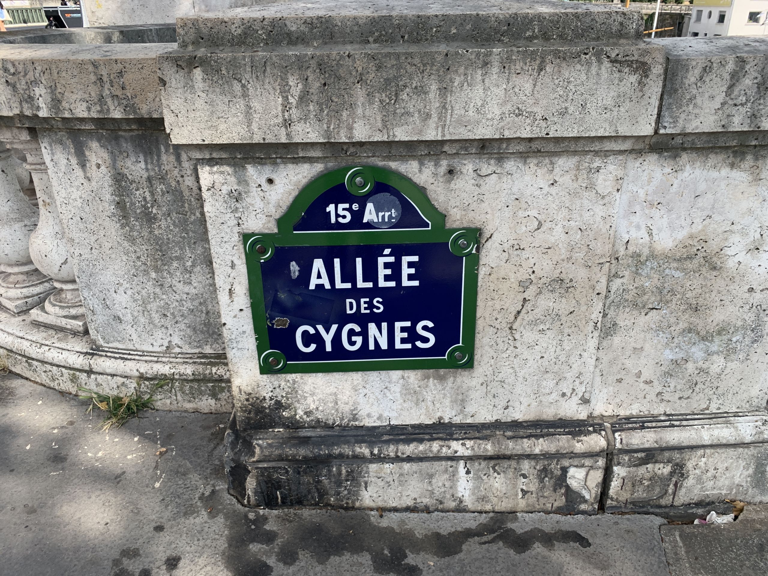
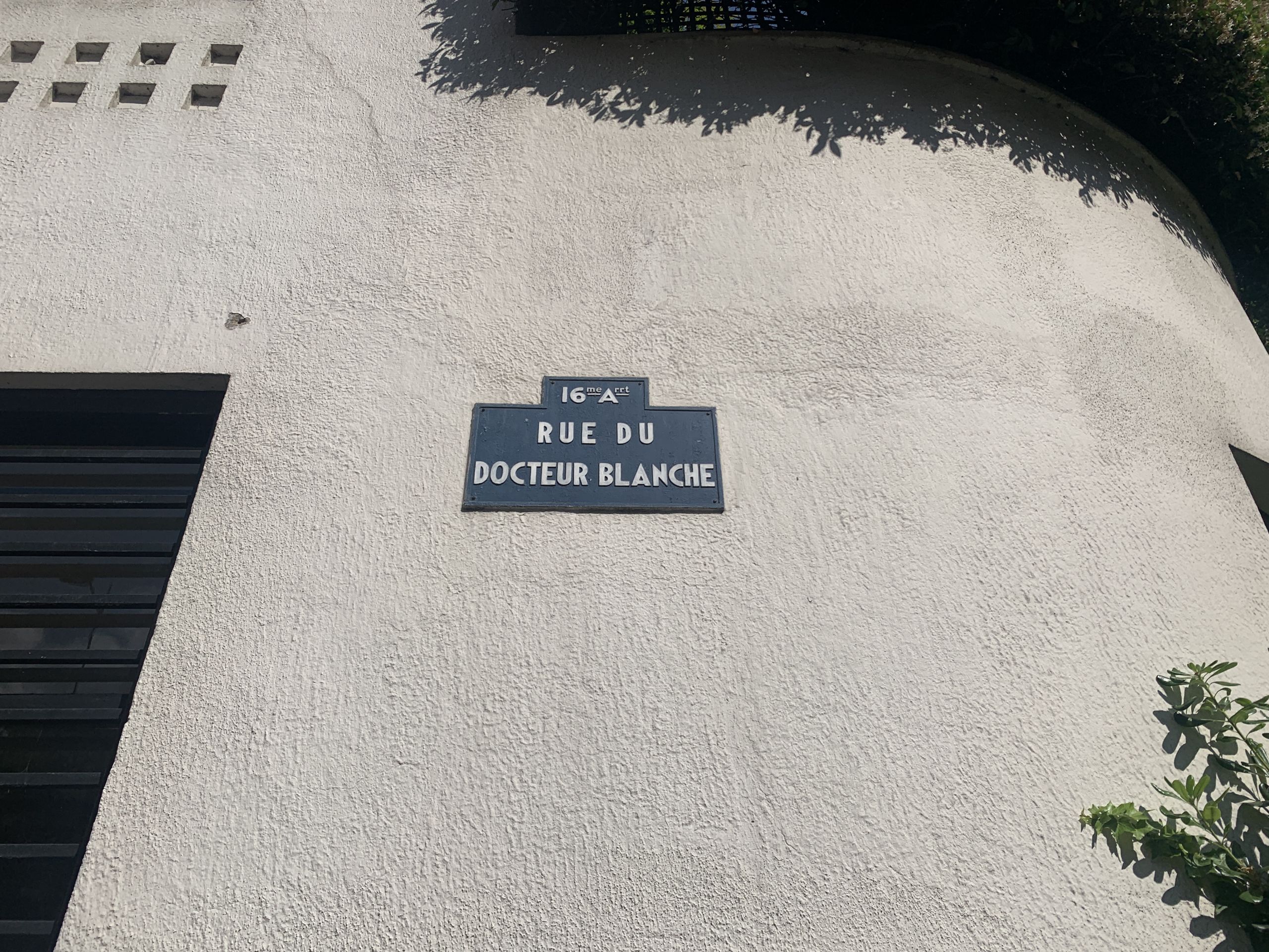
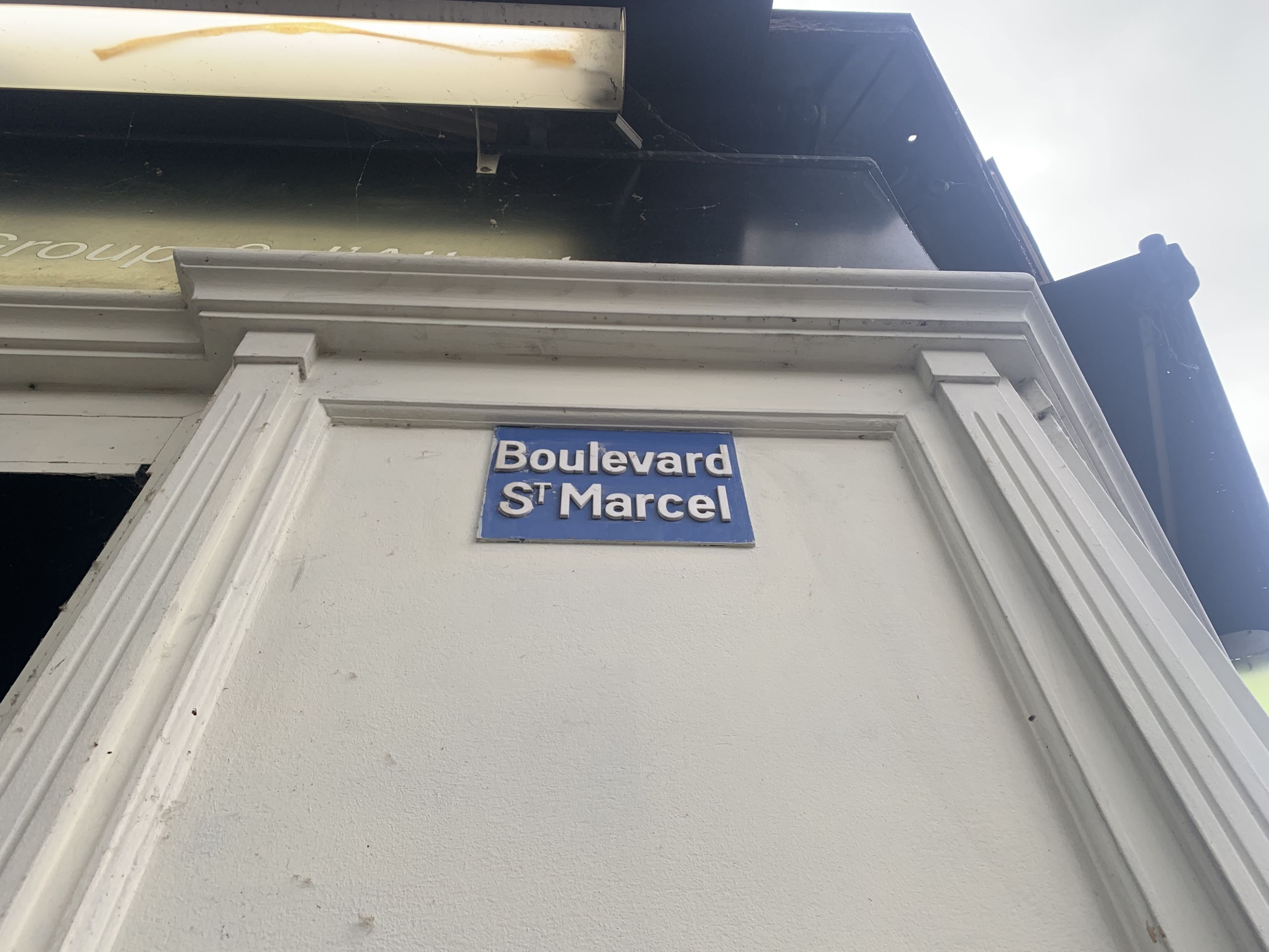
Paris has some beautiful plaques.
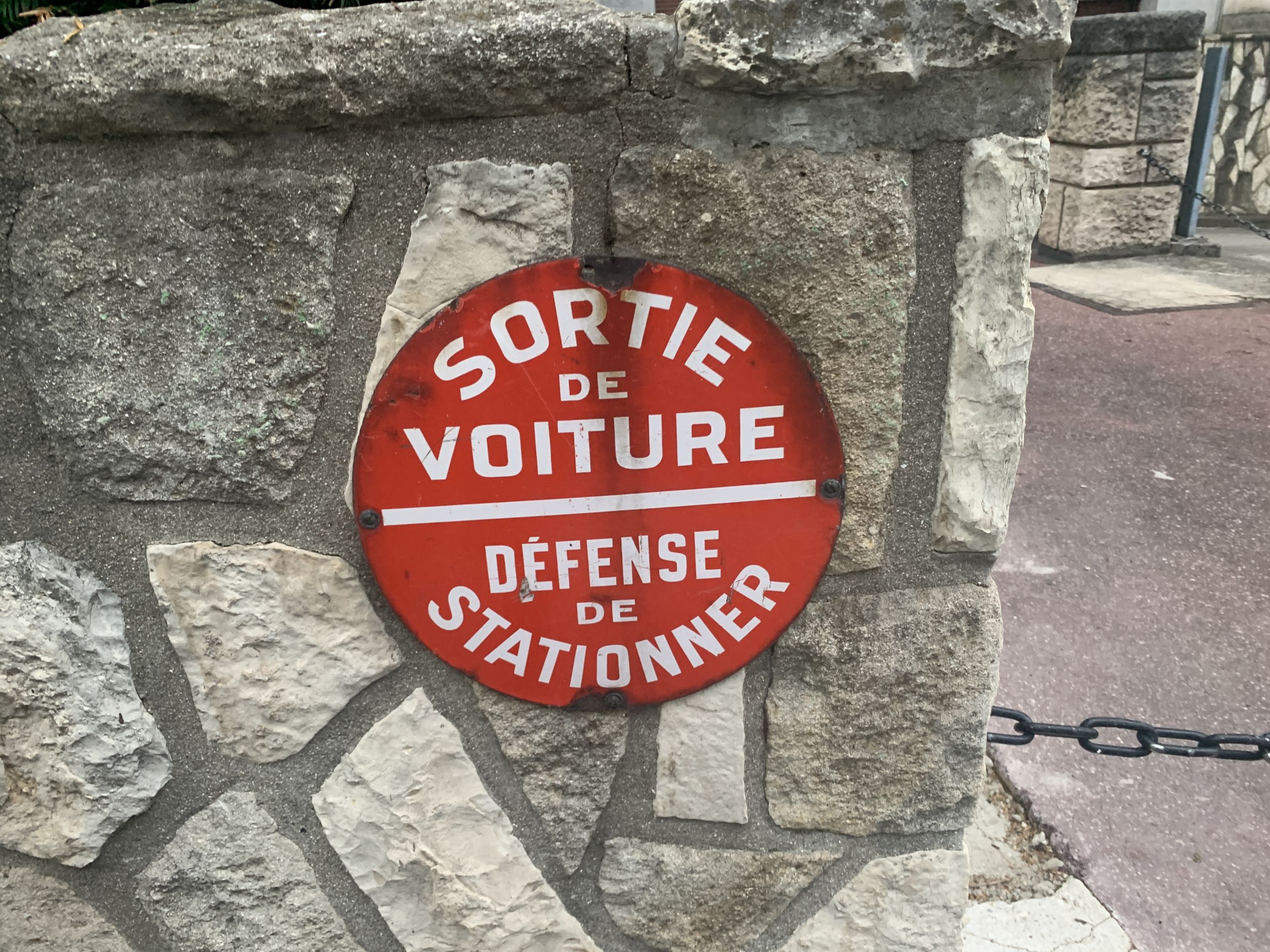
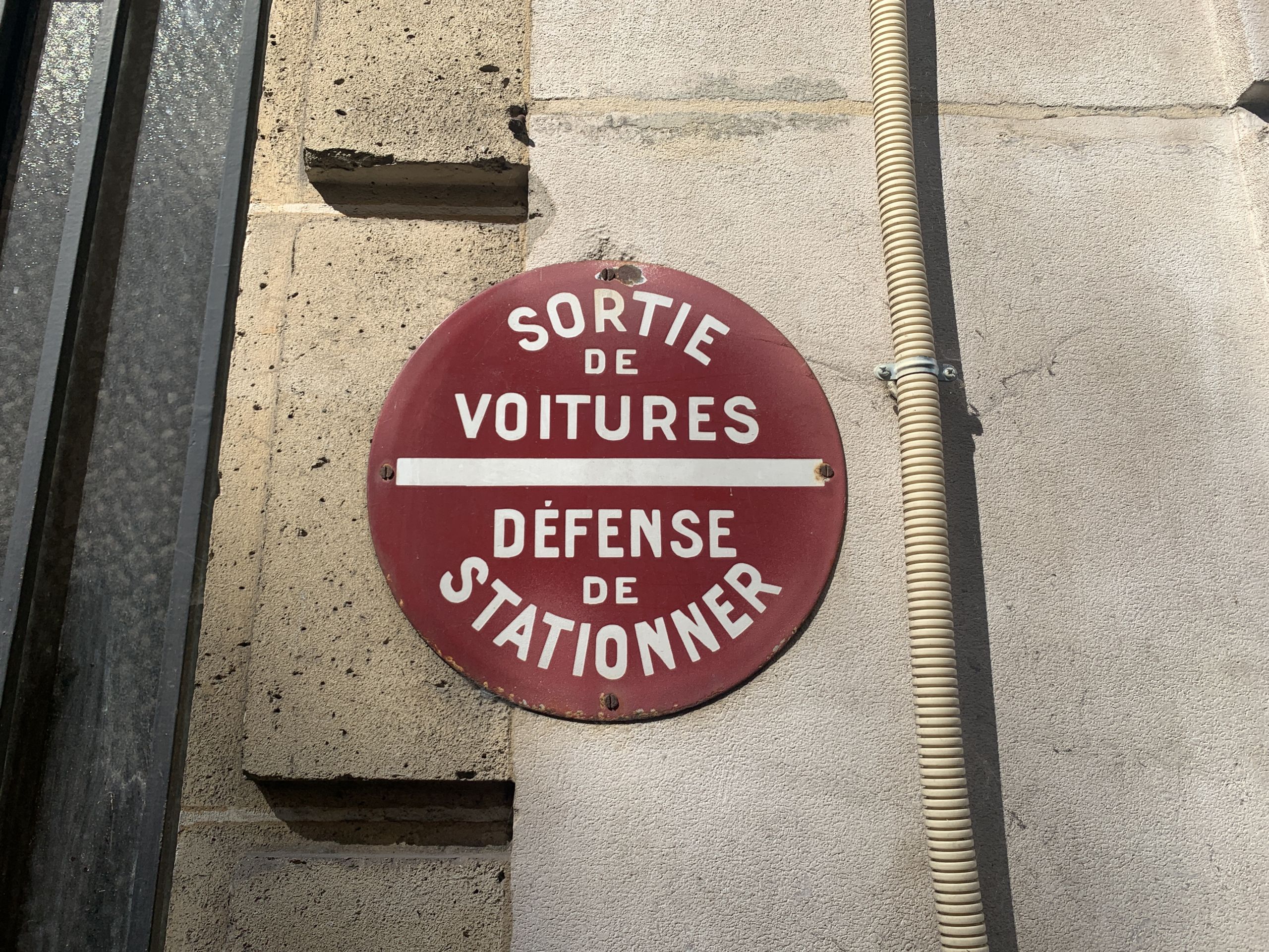
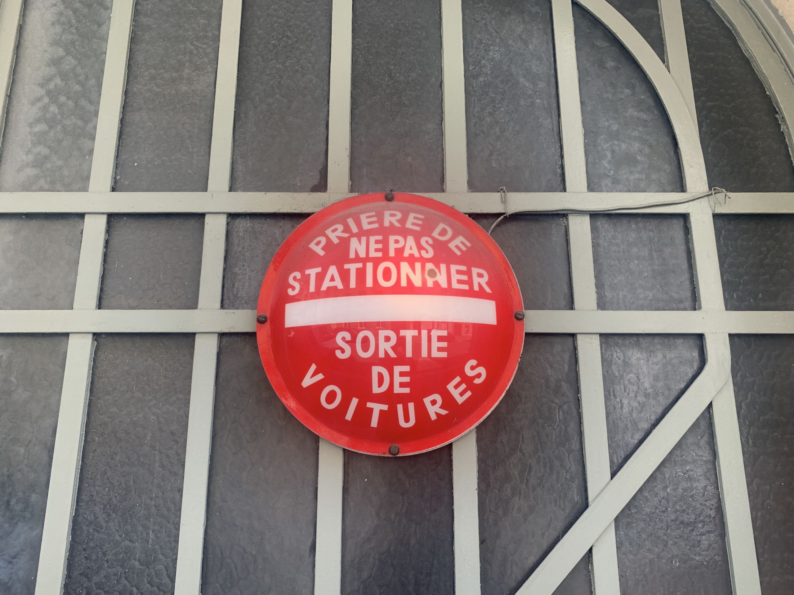
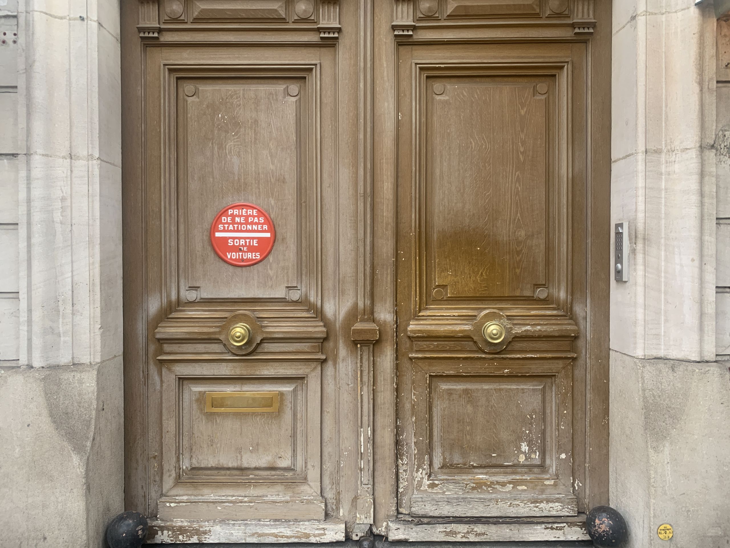
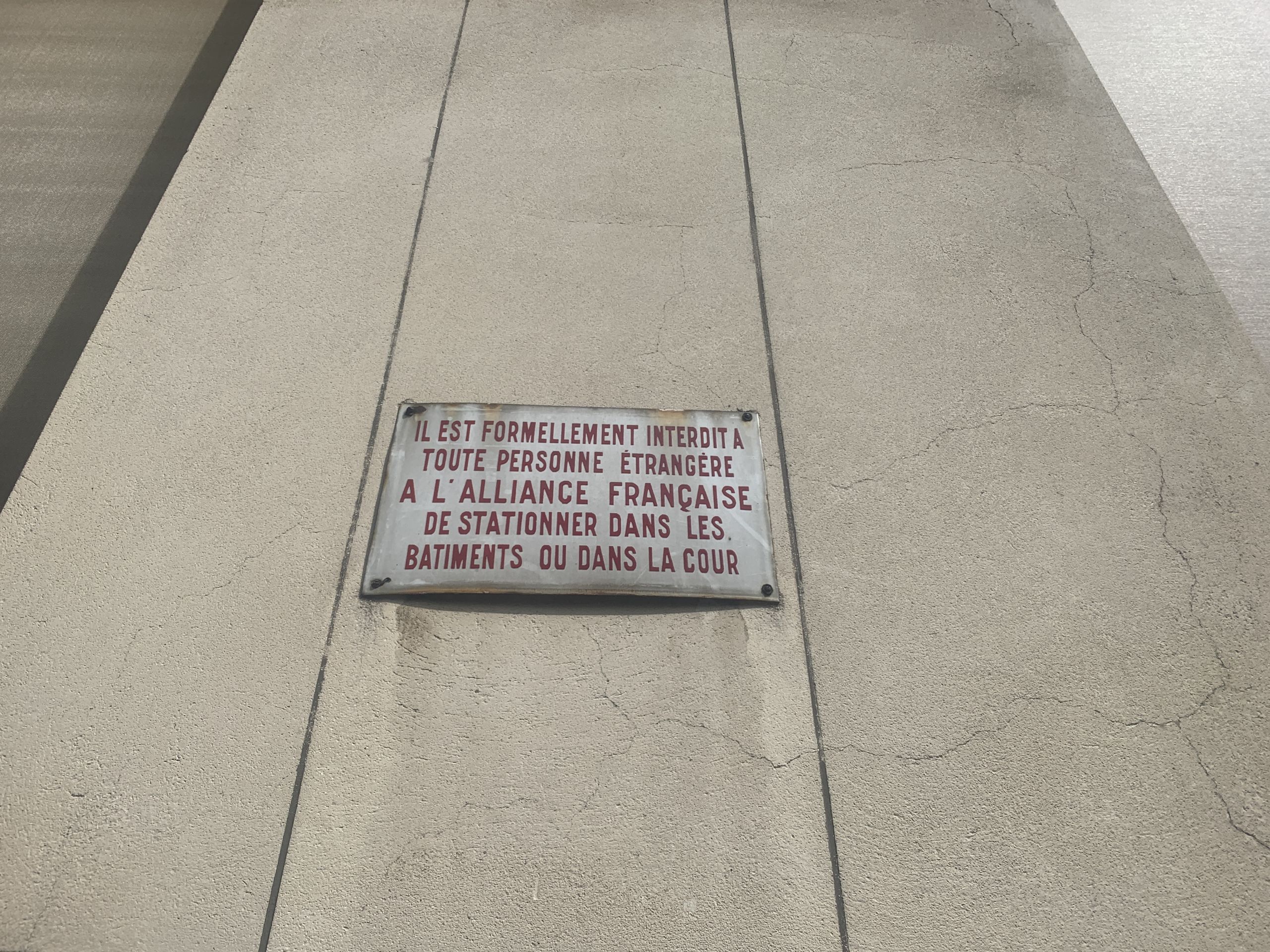
No parking allowed:
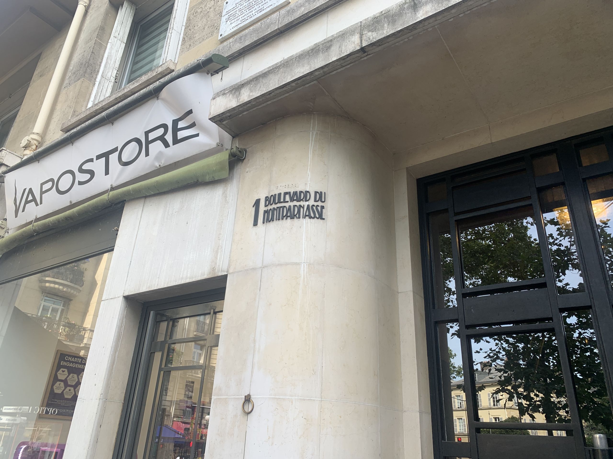
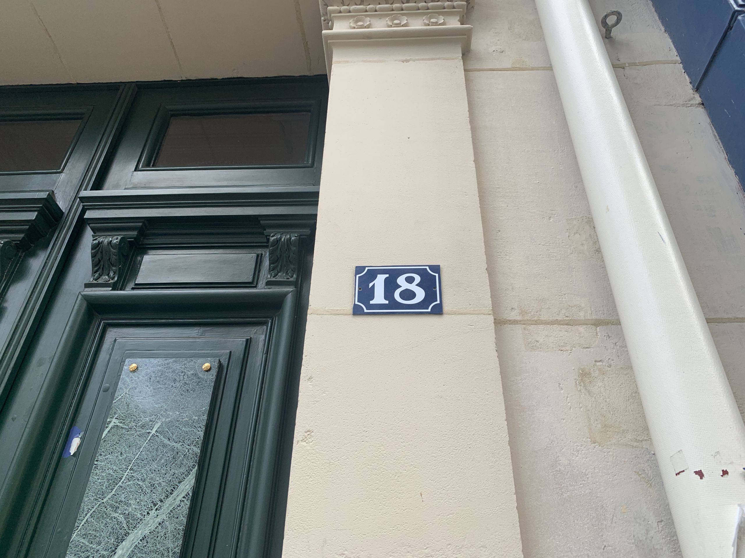
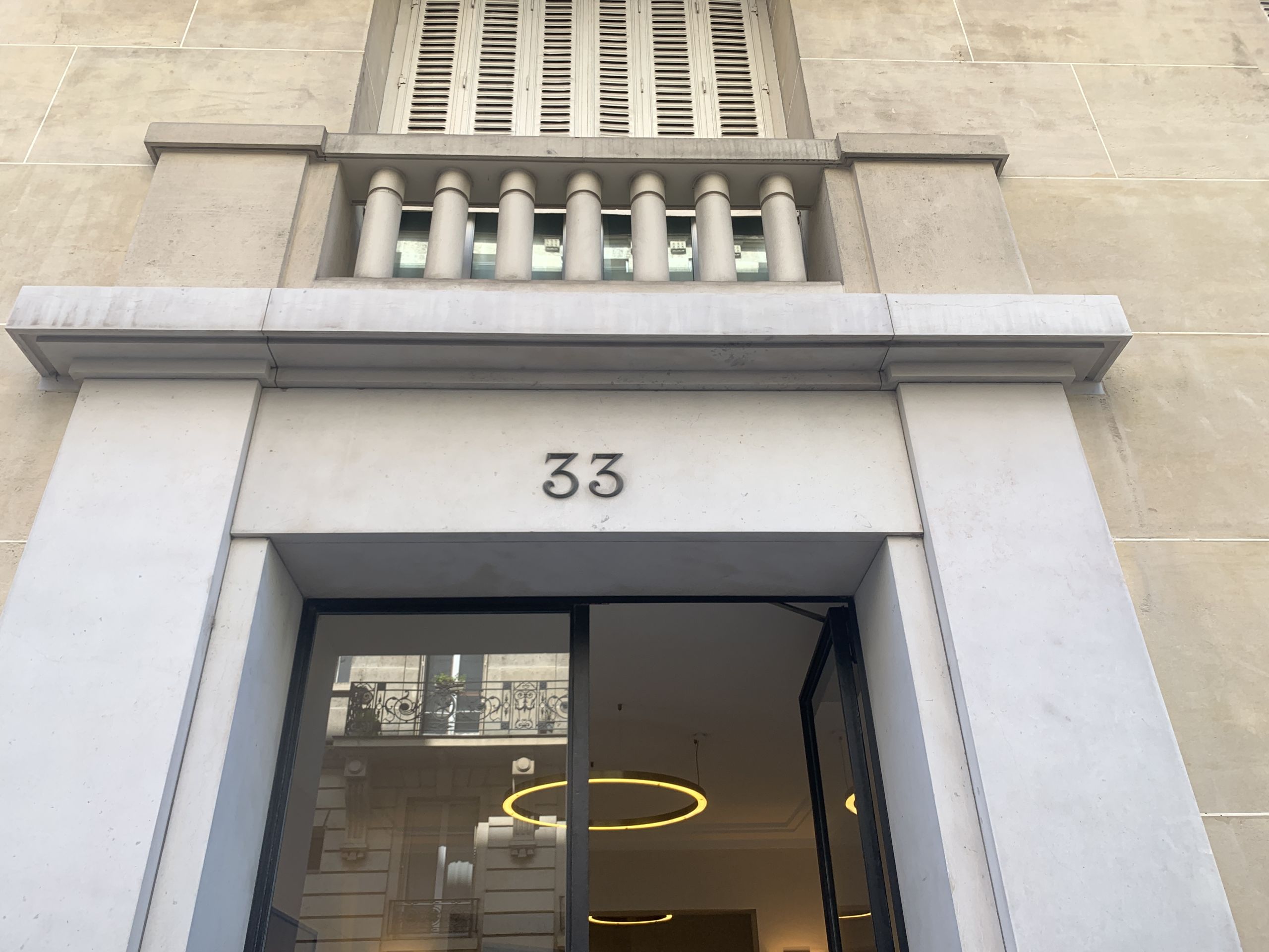
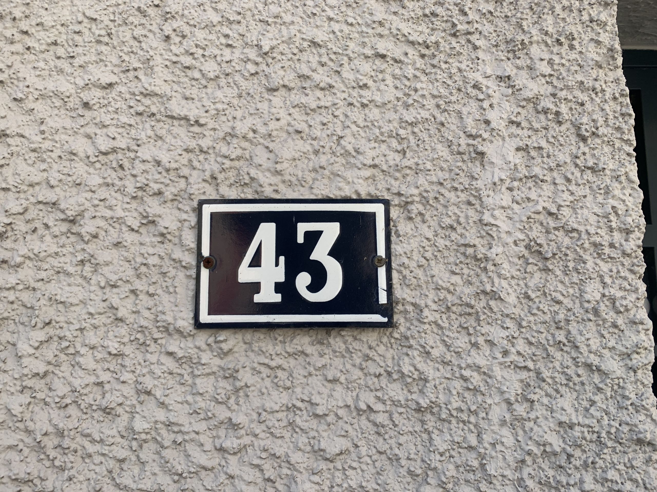
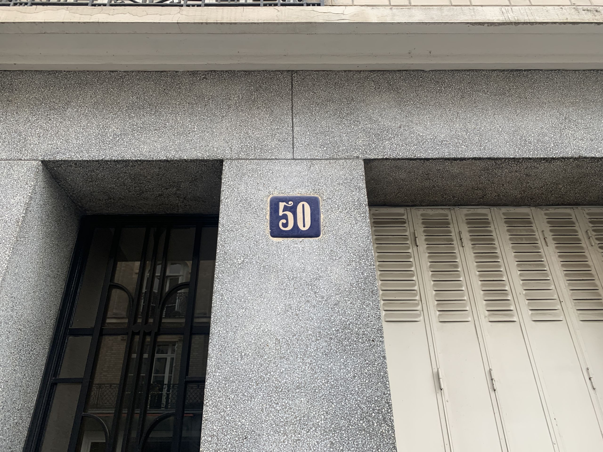
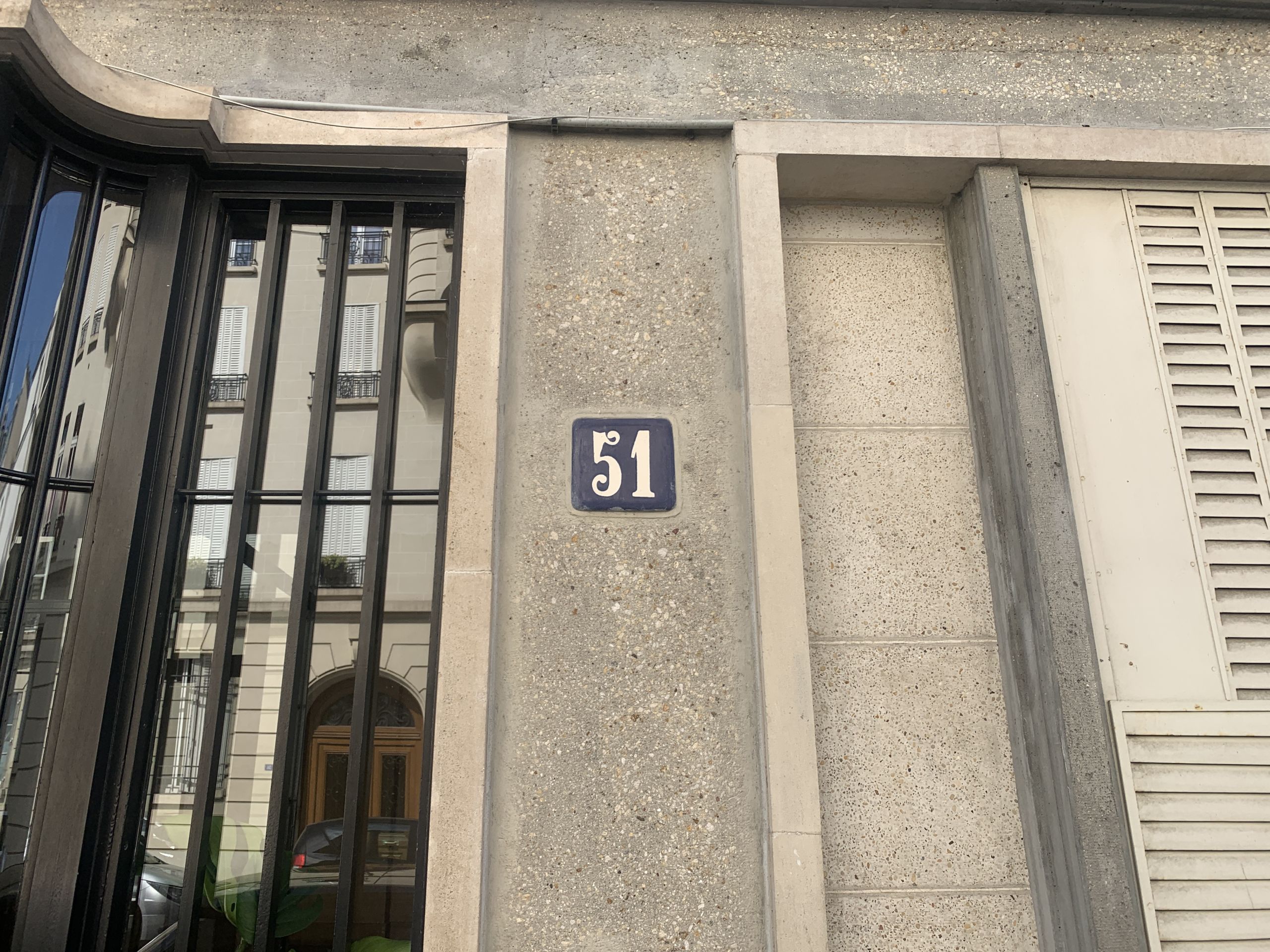
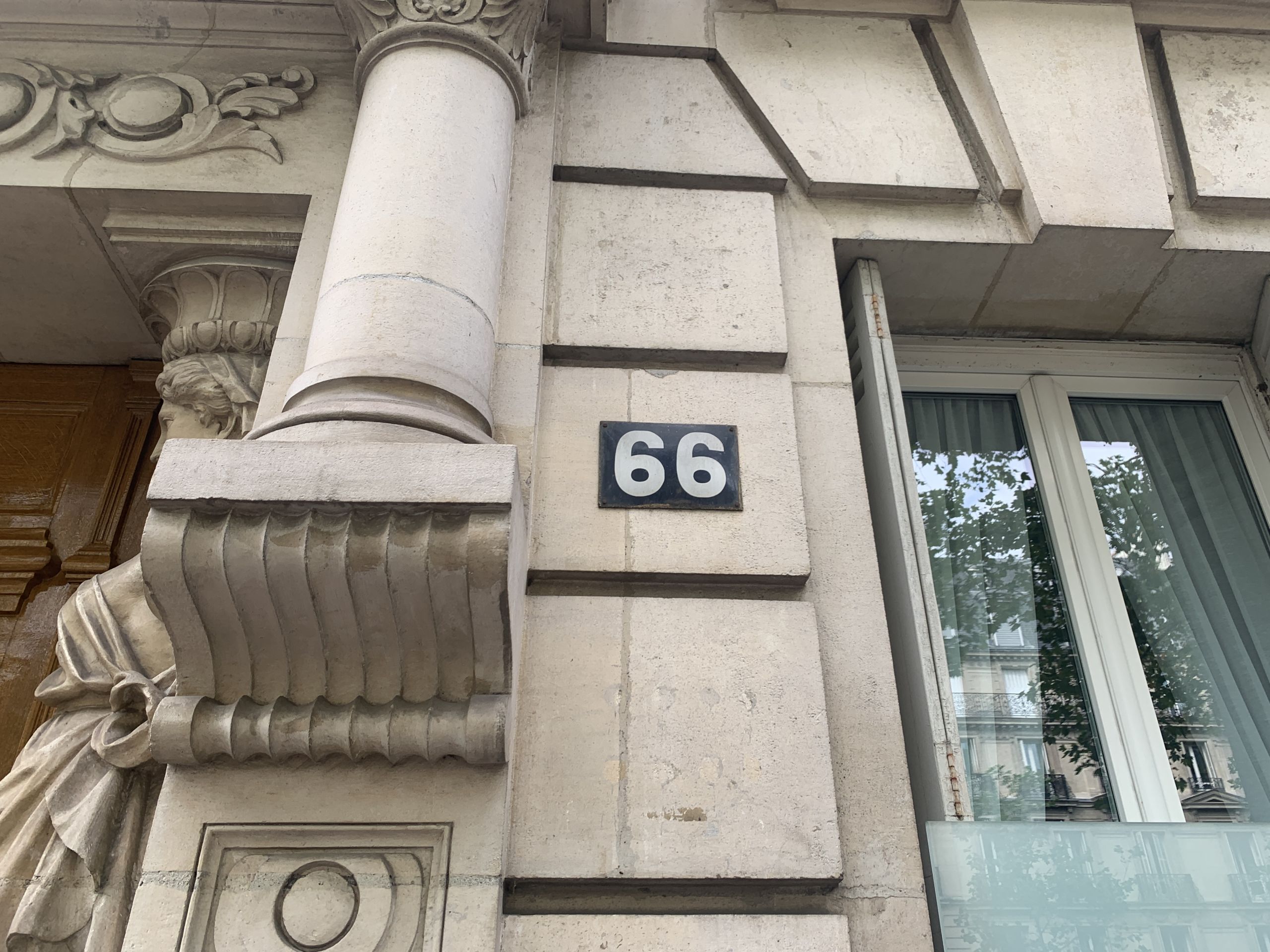
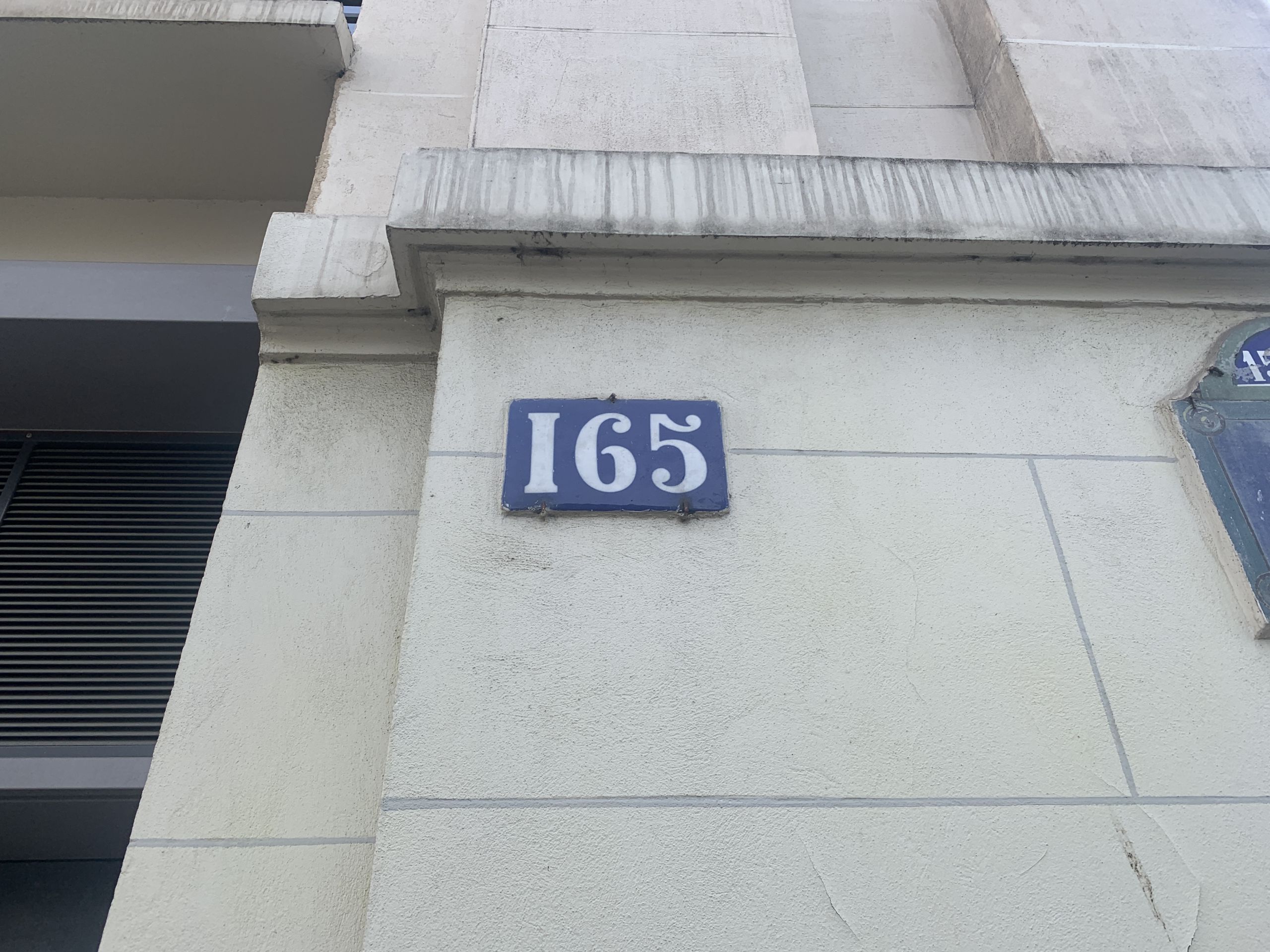
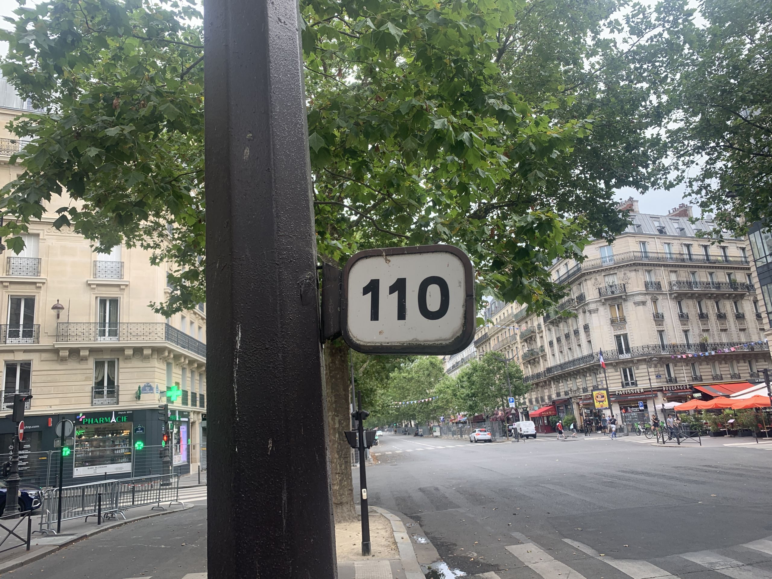
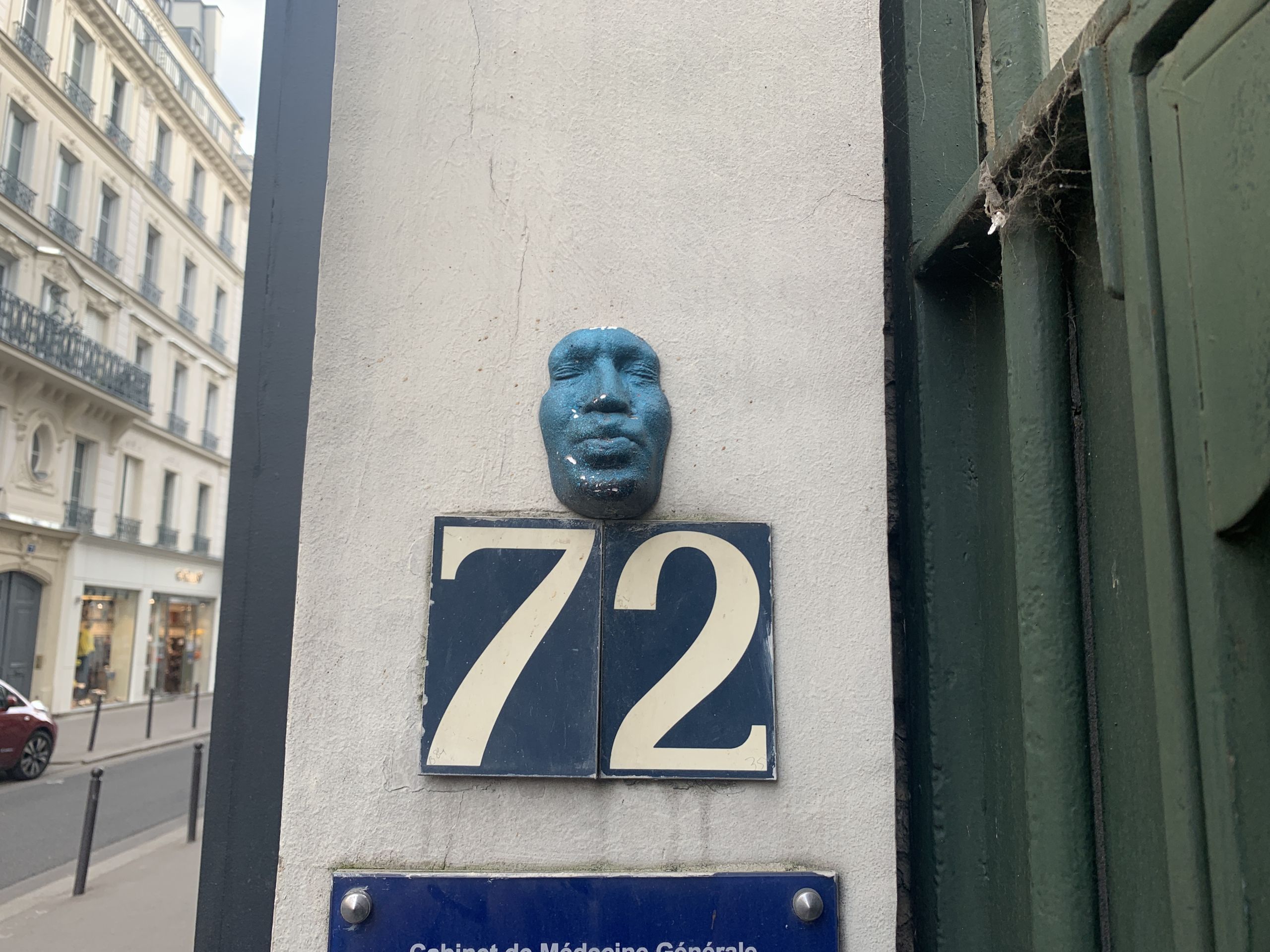
Addresses:
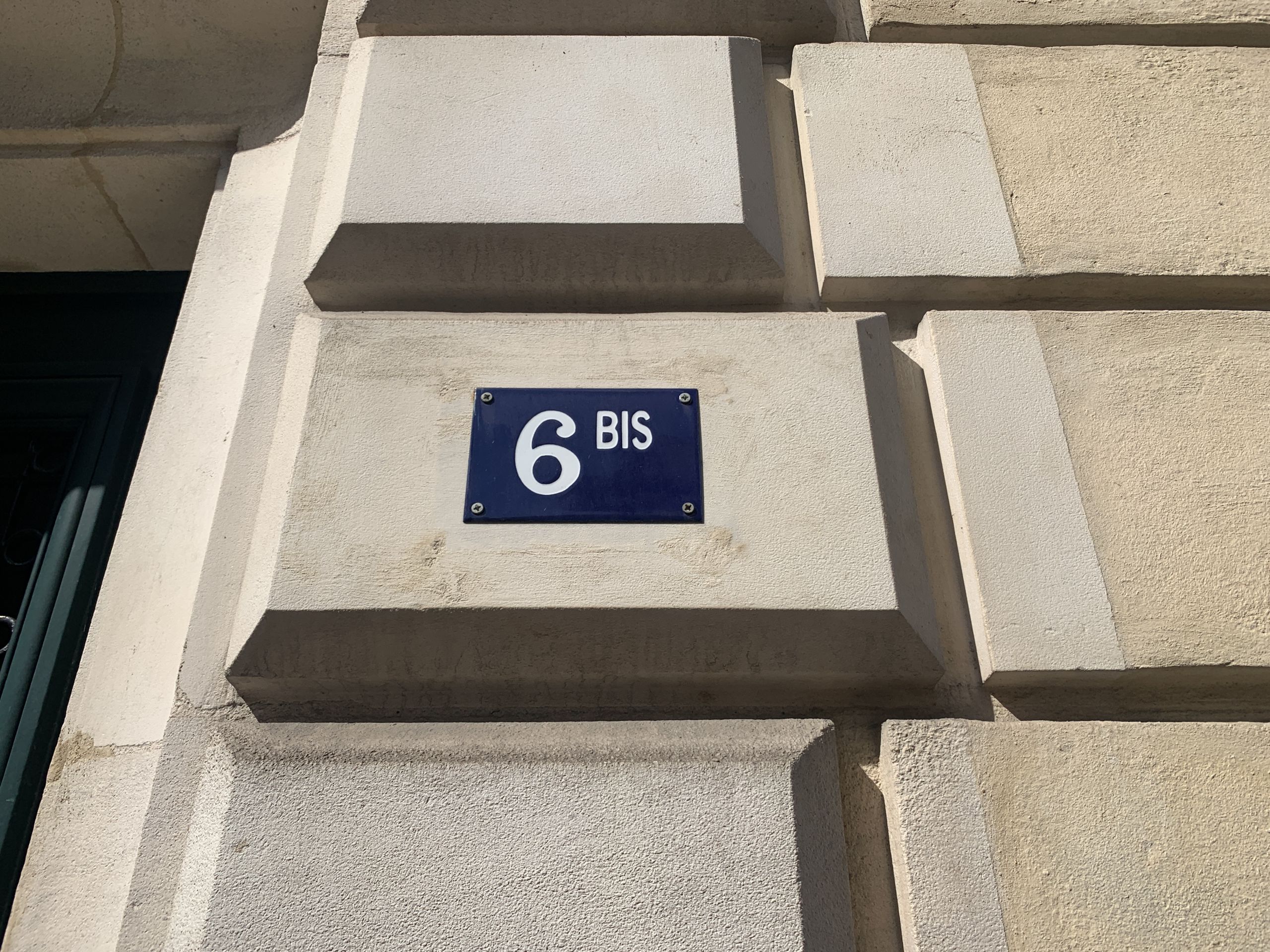
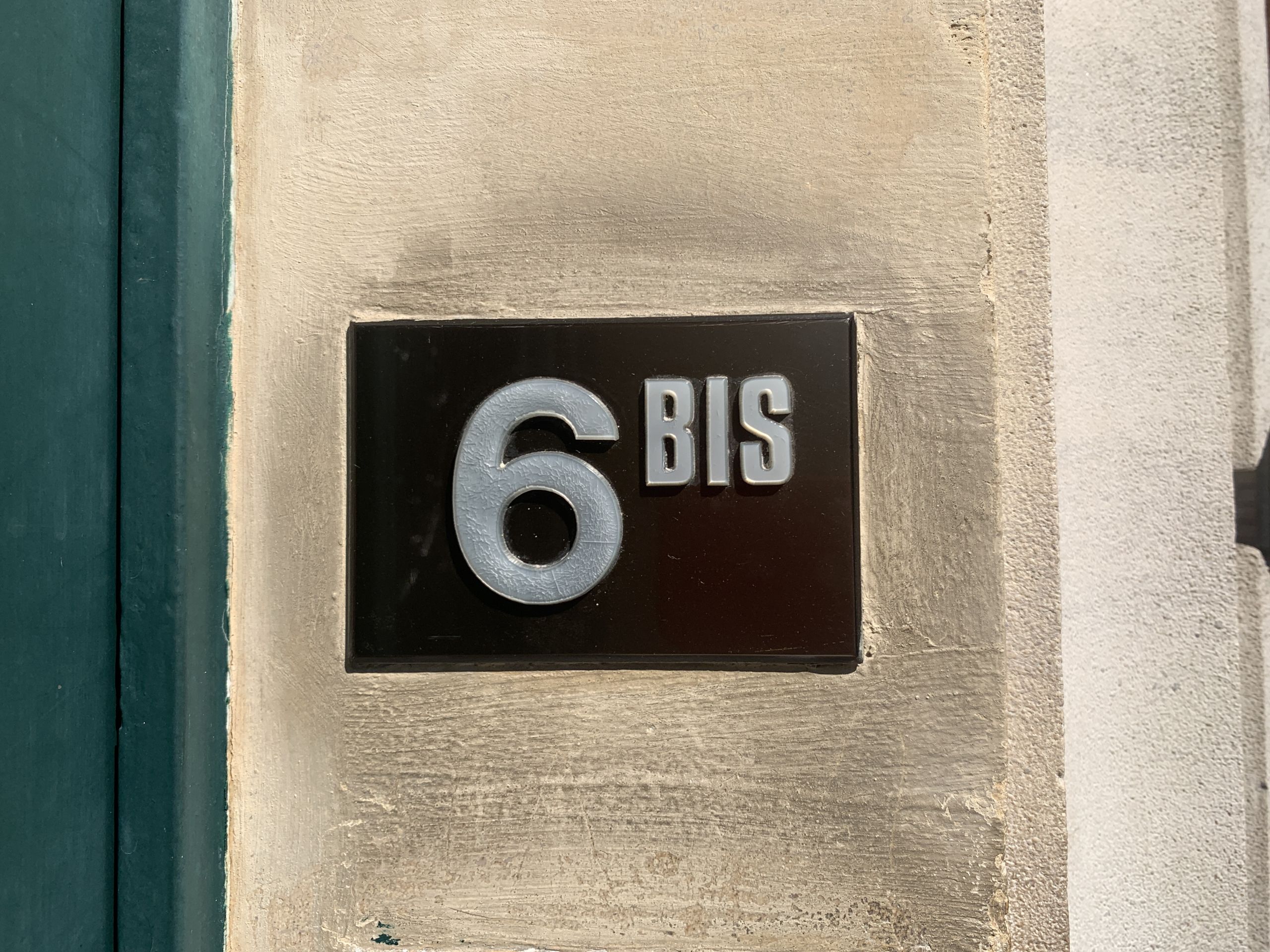
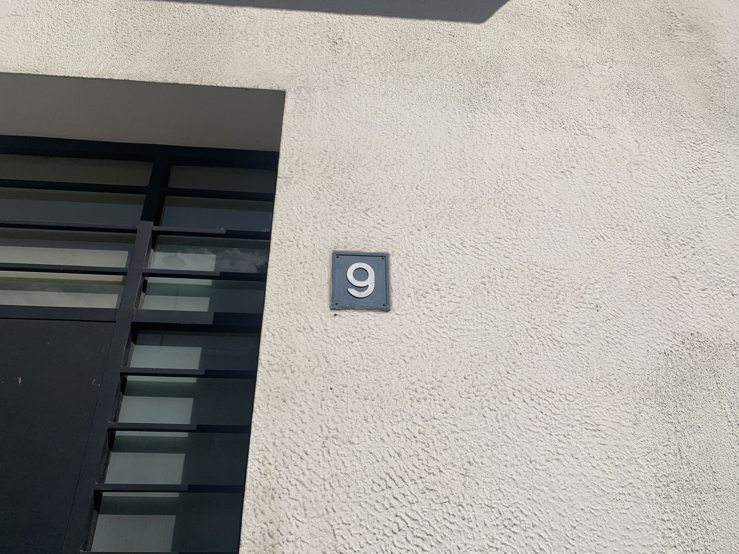
Numbers:
And something wholly different:
MoneroDice is a dice and blackjack game site that accepts Monero. It’s simple and private; there are no accounts or KYC procedures.
Since May 2024, I’ve been helping improve the site’s player experience.

I started by testing the site and looking for bugs. I did find a couple, but nothing critical or worth bringing up in this post.
Much of my work centered around making the site’s wording as clear as mightly.
I transformed titles into sentence case and rewrote phrases to simplify punctuation. I removed phrases like PLAY NOW — previously used in page titles — since they gave off a cheap and scammy vibe. I made a range of corrections to the FAQ.
“Select your odds & win multiplier” became “Choose your win multiplier & odds”. The word chance was ubiquitously replaced with odds.
Verbs are the mightiest words. Thus the Feedback page’s full title “Feedback request” became “Leave feedback”.
Multiplier symbols * and x were all transformed into the traditional (and beautiful) ×.
I also helped write a promotional text for Cryptwerk, and made a banner for it:
But it’s not all about words. The user interface’s functionality matters too.
Since 🚀 and 🗽 emojis were used to show the game mode in the Recent games table, I added them to the mode selection itself:

I flipped the order of Feedback comments to show the latest ones up-top; feedback is not a blogpost discussion.
A good user interface forbids pointless actions. Thus, I froze a bunch of buttons in various circumstances:
I also made sure the email address in the footer became clickable.
The other smol (but helpful) improvements, both to interface and typography, are too many to list here.
To lessen cognitive burden, I stopped listing buttons’ functions on their hint pop-ups. In this case, the words “Double down” no longer appear:

When disabling the computer’s voice, it no longer reacts by saying “voice disabled”.
I also suggested MoneroDice sign the Monero Circular Economy Pledge — it was already matching the criteria. MoneroDice is now one of the Pledge’s signatories.
More people than ever are playing MoneroDice, and they are sharing their delight on Reddit, Cryptwerk, and on the site’s own Feedback page.
Here’s the client’s review:
I’m actually quite happy from the work you have done for MoneroDice so far. I’ve made many improvements with your suggestions and advice.
Communication is kept professional.
I like that you are proactive looking for things which could be improved.